Review of artist – Jean Haines

Towards the end of this course I discovered an interest in watercolour painting and part of my investigations into the medium have led me to the artist Jean Haines, mostly because hers was one of the few books in our very small local library!  The book in question is called Atmospheric Watercolours (Search Press, 2012).

What immediately strikes me about Jean Haines style is that it is very loose with a lot of freedom rather than traditional, dark, landscapes which was how I rather naively thought of watercolour paintings.

Jean Haines blog site http://watercolourswithlife.blogspot.co.uk/ is full of her paintings and a real source of inspiration.  Her paintings tend to fall into two categories:

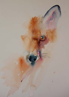
  • images that are only partially painted so the viewer fills in the rest of the subject themselves, such as this fox below

Half Way There

and

  • images where the subject is melded into the background with only certain parts picked out in detail as in this page scanned from her book

Jean Haines 1

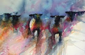
Jean has an adventurous use of colour, introducing colours that do not appear in the subject in nature but add drama and emotion to a painting.  The painting below of her sheep shows a range of colours on the sheep bodies that would not exist in real life but give the work a huge vibrancy. This use of colour is something that can be translated into my textile work, throwing in colours to really make a piece of work come alive.

sheep

Also the painting of Venice below has very glowing, pure colours. Referring back to the colour studies I did from David Hornung’s book Colour: A workshop for artists and designers, Jean uses a lot of prismatic colours, a broad range of hue and a broad range of value to create maximum impact.

Venice

To introduce myself to Jean’s style and use of colour I decided to do some painting in watercolour myself, trying to achieve her sense of freedom.

To begin with I tried her technique of painting a background first, and then picking out detail from the shapes that appear in that background.  As it is Spring here we have just had Daffodil Day and I had some real flowers to use as a subject.  I prepared a background with a central wash of yellow and peach colours, crumpling cling wrap on the top as it dried to form different patches of colour.  A dark green area vaguely represents stems and the top right purple acts as a colour contrast.  Once the background was dry, I picked out random daffodil shapes but tried to keep them blurred and married with the background.

OLYMPUS DIGITAL CAMERA

The result was quite good with the daffodils but I feel I covered too much of the paper with paint and needed to leave more white areas to counterfoil the colours.

My colours are also not pure enough, probably because I am being too cautious with their usege which means I layer colours on top to add depth and this loses the clarity and vibrancy, leading to a certain muddiness.

My next experiments were on the subject of whale sharks, an immense oceanic fish that appears in the waters off the coast between March and July each year and grows up to 8 metres in length.  I have swum with one of these creatures and have an abiding memory of it looming up out of the dark waters as it moved by.

The first painting was to get the subject in place and experiment with creating a difference between the central image and the sea even though the colours were similar.  This was achieved using the cling wrap technique for the sea.  But I feel that the painting lacks punch and doesn’t have the colourful drama of Jean Haines’ work.

OLYMPUS DIGITAL CAMERA

A second painting was more successful in introducing un-natural colours and adding much more vitality to the whale shark. I tried to get the idea of the back end of the whale shark disappearing into the dark sea.

OLYMPUS DIGITAL CAMERA

For my third whale shark I took the approach of not painting the whole creature and leaving more white paper showing.  This was more successful in creating a central image with strong colours against a lighter background. I am improving in using stronger colours in my first washes to gain the clarity and avoid muddiness.

OLYMPUS DIGITAL CAMERA

The idea of creating an image and stopping just as it becomes recognisable is one that can be translated into other mediums and I can see this working particularly in techniques like applique.  I also like the method of allowing the background to dictate the main image. For example, the following piece of fabric which I ice dyed has definite floral patterns in it that could be picked out in stitch to create whole or partial flowers that merge into the rest of the background.

OLYMPUS DIGITAL CAMERA

I have picked up a lot of ideas and inspiration for the use of colour, composition and the partial representation of forms from Jean Haines work which shows the benefit of looking at the work of artists across multiple disciplines.
Book review – Tapestry Weaving, design and technique

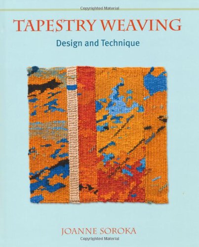
I was struggling to find the recommended books for Assignment 4 on the State library loan list so I took pot luck and ordered Tapestry Weaving: Design and Technique by Joanne Soroka. I was glad I did as I found it to be an excellent and interesting book and would recommend it to be added to the reading list!

51WP8IZTQ9L

The book starts with chapters explaining the basics of What is Tapestry? and The Origins and History of Tapestry Weaving. These were useful introductions to explain the fundamental features of Tapestry weaving and the common misunderstandings around the word “tapestry”.  I was quite intrigued to find out that originally most tapestries were worked on their sides (due to the width being too large for a loom) and from the wrong side – quite a challenge for the weaver.

Further chapters discuss simple tapestry weaving, equipment and materials and more advanced techniques including Soumak and different ways of adding knots to create surface texture.  I was particularly interested in the sections that explain adding extra wefts and warps to form a second layer of threads or tapestry and how these can be used to expand the range of surface structures.

The book covers ideas for display and hanging, and how to care for tapestries.  It also has small sections featuring contemporary weavers.  I liked the feature piece on Jo McDonald who has produced large scale works using second-hand books.  The scan below shows work in progress of book pages being knotted around the warp and the photo underneath is the finished work Unique Reflections?

img086

img087

My idea to develop this would be to mix up the weaving techniques, with some picks of plain weave, maybe some Soumak and other variations to build up a landscape from the old books.  So the books are telling the story of the land.  This could work in colour, with magazine pages used to form the colours of the landscape.

The other example that appeals to me from the book is the following piece called Golden Section which was made by the author. The aspects of this that I like are the use of strong, bold colours and the use of layers that build up colour and texture.

img085

Book Review – Structure and Surface Contemporary Japanese Textiles

5137KC8FSZL

This is another book on the recommended reading list for Assignment 4 and again I was able to order it through the State library service.

I have to admit to being singularly uninspired by the content! Maybe the textiles within needed to be appreciated in the flesh rather than in photos, as, while they all had a simple beauty, they did not strike me as being anything out of the ordinary.

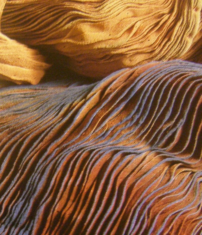
I did like the foremost shawl below by Jurgen Lehl, which was made from silk which has been Shibori pleated and dyed but have seen many similar and more attractive (to me) items using the same techniques in galleries and shops in Australia.

OLYMPUS DIGITAL CAMERA

I had to ask myself the question of what made these textiles worthy of being featured in an exhibition and a book? I can see the appeal as a collection to mark a point in time, a reference so that in the future people can see what textiles were being produced at that point in time.

The majority of the textiles were in a single, subdued colour with limited surface treatment.  If I can learn anything from looking at this book it is that sometimes simplicity and subtlety is the key and that textiles do not have to be complicated or have multiple techniques and embellishments to be successful.

Mc Carty C& McQuaid (1991)Structure and Surface Contemporary Japanese Textiles Museum of Modern Art New York

Book Review: Three-dimensional textiles with coils, loops, knots and nets

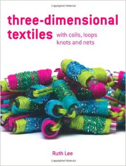
This is a recommended book for Project 8 so I arranged to borrow it through the State library system. As the title suggests it concentrates on simple techniques such as knotting, twining and coiling; techniques that can be used with little or no equipment or machinery.

download (2)

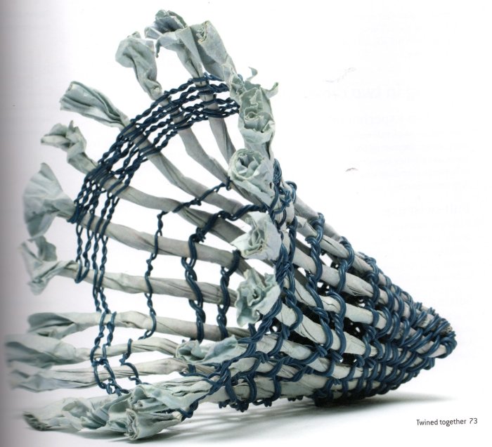
The author, Ruth Lee, sets out the basic elements of each technique in dedicated chapters and then shows how the techniques work in two dimensional and then three dimensional forms. The really interesting parts are where techniques are combined or worked in unusual materials such as the twined vessel below made from twisted paper tape and electrical cable.

img083

The elements I like about this book are that it covers the basics, with clear diagrams of knots for example and instructions on how to deal with yarn ends, but Ruth also includes sections throughout the book on Moving On, Further Experimentation and Design Decisions.  These sections give hints and pointers for how a textile person can take ideas forward but without giving a set blueprint, leaving the artist free to make their own decisions using the book as a tool and source of methods.

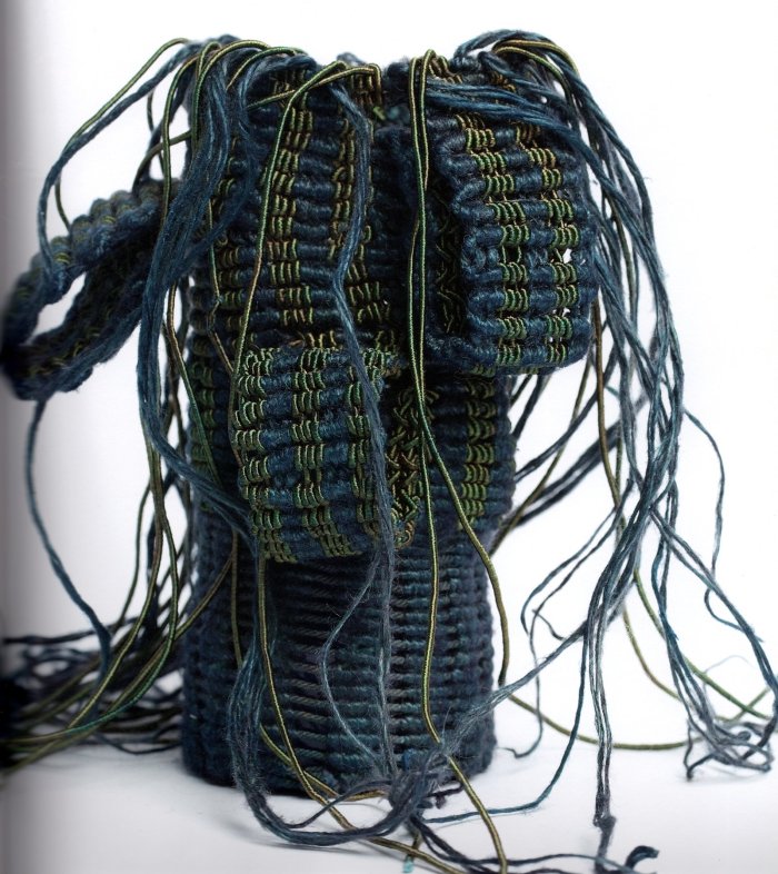
The photographs throughout also show a wide range of ideas that can act as a springboard for further development. The photo below is taken from the chapter on knotting.

img084

The small coiled bowl from wrapped piping cord that I made for Assignment 4 Project 8 Stage 2 Exercise 2 is based on the Coiling in Three Dimensions section from this book (bowl pictured below for easy reference).

OLYMPUS DIGITAL CAMERA

Lee R.( 2010)Three Dimensional Textiles, Coils, Loops, Knots and Nets Batsford, London

Book review: Stitch Magic

51RNEBEXP9L

Beaney, J & Littlejohn, J 1998, Stitch Magic, BT Batsford Ltd, London.  Borrowed from the library.

This book largely concentrates on hand stitching, with one chapter that also discusses combining hand with machine stitching.  It is not a project book, or a prescriptive recipe for stitch, but rather a book of suggestions for how different stitches can be varied to add interest and produce different effects.

It is packed with colour photographs of textile pieces, one of the good points of this book is that the photos are close ups of work and show enough detail so the reader can see the stitches clearly.  In a lot of the examples the stitches are very densely packed or layered on top of each other; in other examples where the stitches are more spaced out they are cleverly blended with the background through use of colour, with the backgrounds being painted and toning threads used so sometimes it is hard to tell which is background and what is stitch.

There are two sections that I particularly found of interest.  One is the analogy of Mountains and Foothills for layering stitches “high peaks and ridges give way to lower ones before the foothills take over and merge into the undulating plains at the base of the mountain”.   The other is the guidance given for tracking the different shades through an image that is to be created in stitch, by following the lines of each shade down the image with a finger to see how and where each shade links up and unifies the piece.

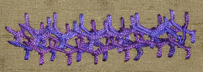
I also used the idea of layering and working buttonhole over another stitch when I did my stitch samples for Project 2, in the Cretan stitch and Cross stitch examples below:

cretan cross