Work has been continuing on my theme book of Ancient Egyptian Jewellery. Following the advice of my tutor I have looked afresh at the books I have and have done some categorisation under the headings of Texture, Form, Composition, Materials and Colour. For each category I have created an A3 size mood board with pictures from the library books and small studies of my own.
Texture

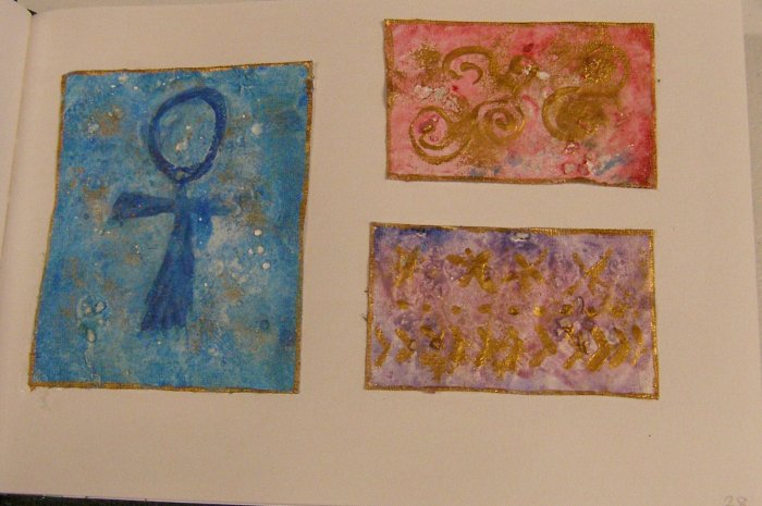
The texture of the jewellery has smooth metal, raised embellishments, wire work, ridges, segmented disks, granulated metal, engraving and beads. I have used buttons, stitched and padded fabric, beading, French knots, pleated foil, joined fabric disks, engraved copper and raised applique to show some of the textures. The beadwork was succesful as it has the most direct link to the real jewellery. The padded fabric sample and French knots were effective in that they show the texture without being a direct copy – so they are inspired by the jewellery rather than trying to replicate it.
I had a further play with texture and created some small pieces on stiff vilene. These were surface painted with gesso sprinkled with salt. The aim of this was to produce an aged effect of the jewellery after the passing of centuries rather than when it was new. I made some marks in the gesso while it was still wet and then painted into those marks after it was dry. The gesso was a bit thin for the marks to hold their shape well but I like these as an interpretation of ideas.
Form

Form refers to the three dimensional aspects of the items. The words I associate with the form of this jewellery are chunky, bold, rounded, raised and exaggerated. I purchased a small flexible silicone mould and used Sculpey to bake some scarab and lotus shapes which I then painted and rubbed with Pearlex powder. These would make good embellishments for a piece but there is the danger that they might seem “tacky” so if I am going to use them it will have to be with careful consideration. I played around with stuffing fabric in a couple of shapes and these experiments were OK in replicating the form but again would not stand on their own. The most successful piece from this set of studies was the gathered piece of fabric I did (plain calico centre right of the board). The picture just under this is of a bracelet with “swags” of metal secured by engraved metal strips. This reminded me of one of the samples I did in the gathering exercises in Project 6 so I did a sample with two sets of gathers. This produced the swag effect really well and, like the most successful samples on the Texture board, was inspired by the bracelet rather than duplicating it. I could dye or print some fabric in the appropriate colours and use this gathering effect in my final piece.
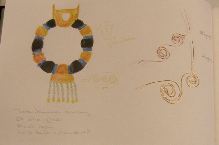
The sketchbook page below shows a study of an earring from Tutankhamun, with large round beads. The flat part of the earring above the fringe had spirals of wire set onto the surface.
Composition
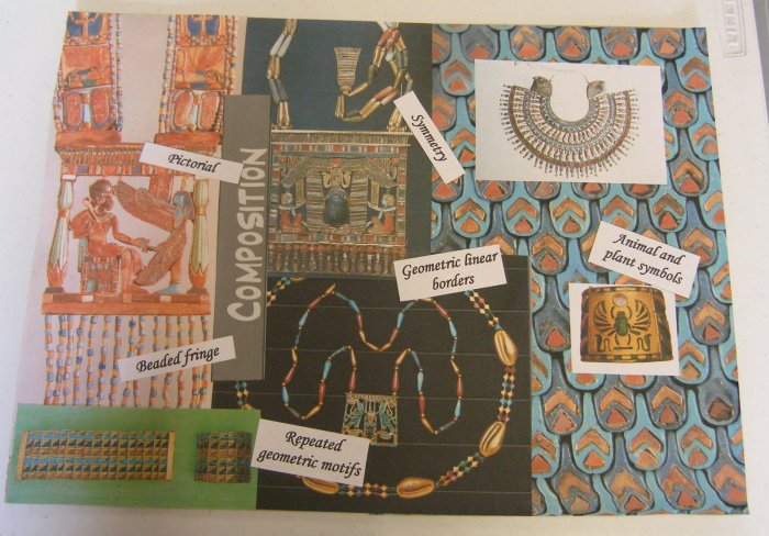
I did not do any samples for the Composition board but selected the main aspects of it to take into consideration for my final piece. The composition of Egyptian Jewellery is very defined. The pieces are very symmetrical and use a lot of geometric borders or repeated motifs. Pictorial elements are strongly featured particularly on the pectorals (large chest pendents) which will frequently feature a scene including a deity. These pectorals are finished with beaded fringing and have symmetrical intricate straps that go over the shoulders and then have a counterweight that hangs down the back. Animal and plant symbols were used a lot, particularly the scarab beetle and the lotus flower.
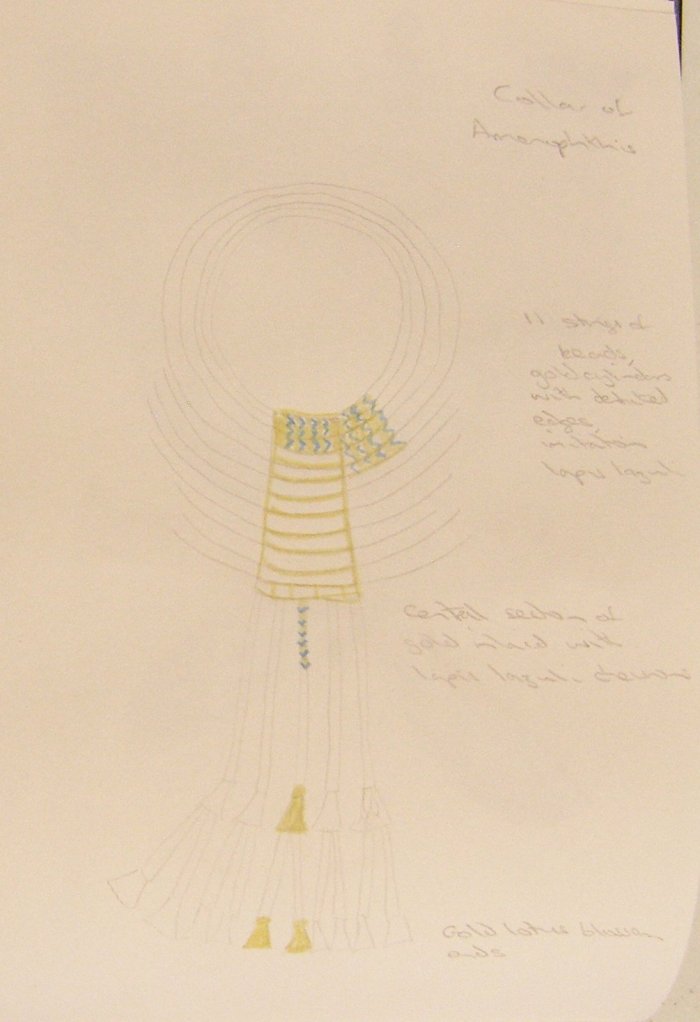
The sketchbook page below shows the Goddess Mut who featured a lot in the jewellery, and also some of the geometric symbols used.

Materials

There was a limited range of materials in use at the time this jewellery was made. Gold was readily available and therefore featured strongly, with silver to a lesser extent. Silver was known as white gold, so was differentiated by colour rather than perceived value. Beads were from animal, mineral or constructed materials. Animal was bone and ivory, mineral were semi-precious gemstones such as agate, turquoise and carnelian. The most common constructed bead was called faience, a kiln fired paste that was a turquoise blue in colour. It is possible to make faience today but as I haven’t got a kiln I decided not to go down that path!
In my samples I baked some Sculpey in the shape of a falcon wing and painted that with the colours of the semi precious stones in the original gold. This sample is too brash and lacks subtlety. I used Nespresso coffee capsules and these match the materials quite well as they give the colour and smooth surface texture. Most of the Egyptian jewellery was very bold in design but I have found a couple of examples of more delicate work, one of which is the diadem on the board so I have included samples of wire and a metallic thread that I could use to represent this. As well as beads and metallic foil, I also used the hot glue gun to produce a long blob of black glue which I rubbed with Treasure Gold, a metallic wax. I was pleased with this result as the black glue provides a real depth of colour underlying the gold and the surface effect looks like the gold used in the bracelet next to it.
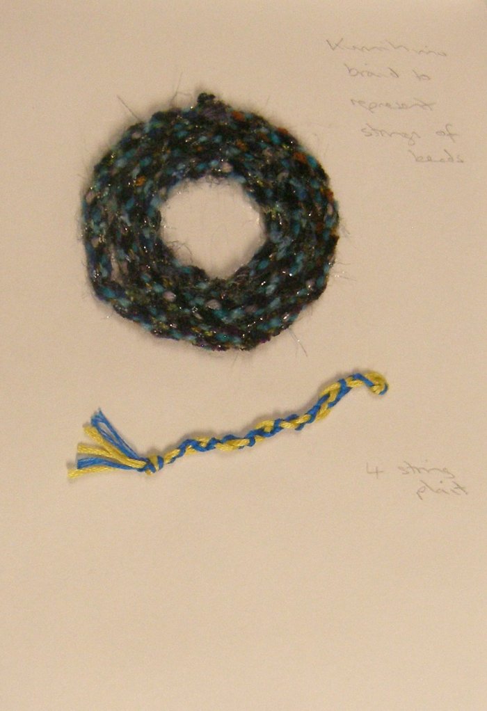
One of the other pictures of jewellery has concentric circles of beads and a possibility with this is to use Kumihimo braiding to represent that circular effect.
Colour
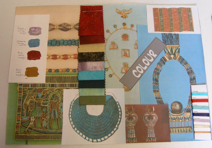
For colour I did samples using some paints and nail varnish, wound threads and found some material samples. Egyptian jewellery featured a lot of turquoise through the use of faience and semi precious beads. Red and green were common colours, red from carnelian and green from feldspar. The purple is from amethyst, dark blue from lapis lazuli. The colour palette is fairly limited with gold featuring heavily as the base material.
To extend the colour studies I marbled a piece of material to produce the effect of a piece of Sinai Turquoise I had featured in my theme book.


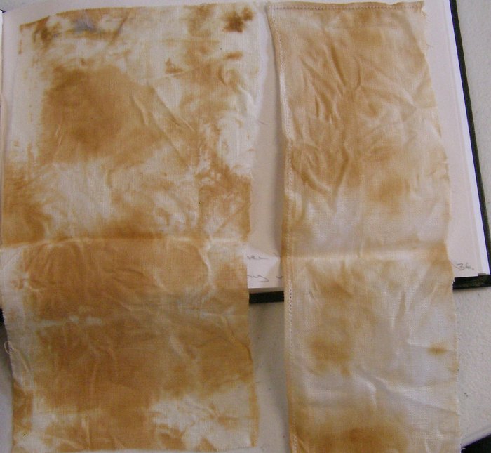
I also looked at associated materials that I might call on for different colours, for example most of the jewellery has been found wrapped in the layerings of mummy wrappings so I could use the colours from the mummy wrappings as the background for my work.
I dyed a couple of strips of linen in tea bags to see what colour was achieved. The result is like aged mummy wrappings which was just what I wanted.
I also made a rough cut lino block from the lotus flower that is used a lot. I laid tea bag papers onto felt and then printed with the lino block. This is another sample that could be expanded to be a background for a larger piece.

When I first read the tutor feedback I was a bit dubious about doing these breakdowns into Texture, Form, Composition, Materials and Colour as I thought my theme book work was developing nicely as it was. I am now very grateful for the feedback as approaching the theme in this way has really brought it into focus in my mind and has made me pay attention to the jewellery instead of drawing pretty pictures of it.
During these studies I managed to produce some samples that have the potential to be taken further, and a lot more that haven’t. I still have no direction in mind for what my final piece is going to be and that is probably good as it means I am not fixed on a set track but can see what develops.


