Assignment 4 Project 8 Stage 2 Exercise 1

The first part of exercise 1 is to form a warp and weft with 2 squares of paper and interweave them.  Then to repeat the exercise but varying the materials used.

The first photo shows the initial sample on the left, made from magazine pages.  On the right is tea bag papers.

OLYMPUS DIGITAL CAMERA

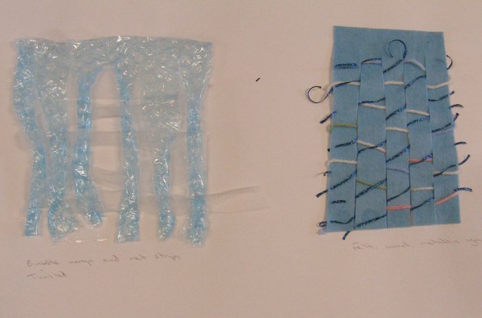
The next samples experiment with contrasting materials.  On the left is bubble wrap which is twisted, interwoven with this is strips of net.  The right hand sample has a felt warp with the weft of wool.  Metallic yarn has then been worked through on the diagonal to provide contrast in shape and texture.

OLYMPUS DIGITAL CAMERA

On the left below are pages of sheet music.  These would work better if the angle of the weft had been rotated 90 degrees to give greater contrast between the directions on the printed music.  On the right is a recycled piece of nuno felted fabric that I made, with the front and reverse sides being used to contrast the texture.

OLYMPUS DIGITAL CAMERA

The left sample below is my favourite.  It combines a piece of calico that I marbled and black velvet fabric.  The velvet has only been worked through strips in the central area of the calico so the calico provides a border all around.  This sample provides great contrast between the texture of the velvet and that of the calico, a colour contrast between the purple/bronze metallics against black and also the contrast between light and dark.  On the right is a double woven sample made using coloured paper.  I worked 2 separate pieces, then cut those into strips on the diagonal and wove them through again.

OLYMPUS DIGITAL CAMERA

Assignment 4 Analysing colour, texture and proportion

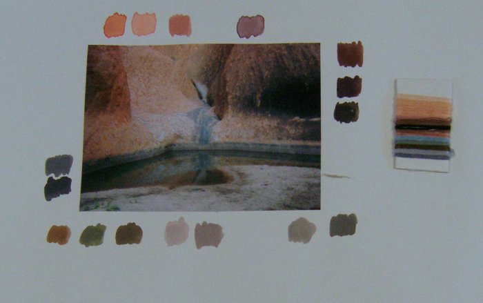
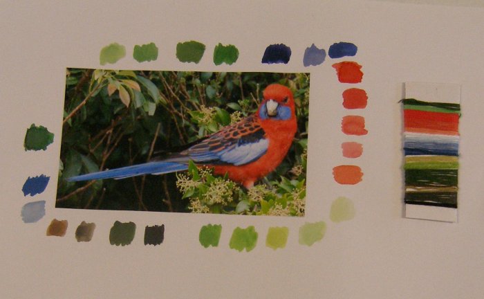
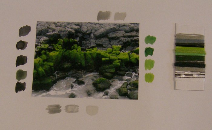
This exercise is to practice more the techniques of colour matching that were done earlier in the course.  The brief is to select 3 images, match the colours in paint and then match the colours in yarns, trying to also match the textures if possible and proportions of colour.

This photo I took while walking round Uluru (Ayer’s Rock) which has the most amazing range of water holes, cavelets and colours.  I used gouache paints and yarns from my collection, mostly embroidery yarns with a few knitting wools as well.

OLYMPUS DIGITAL CAMERA

I photographed this parrot at O’Reillys retreat in Queensland.  The vibrancy of colours is amazing and I tried to pick this out in the paint and yarns, also trying to get the proportion of colour right in the yarn sample.

OLYMPUS DIGITAL CAMERA

I am very fortunate to live in such an amazing country and I have visited a range of fabulous places in Australia so I have a variety of photos taken over a number of years. My last photo is some moss covered rocks in Bunbury. The moss has this wonderful spongey texture and a colour range from lime green to a deep velvet green.

OLYMPUS DIGITAL CAMERA

This type of exercise is good to do as it really makes me look at the image and pick out the individual colours rather than stand back and see the overall combined effect.

Assignment 4 Research Point part 3 – Review of artists – India Flint

The second artist I am reviewing for this research point is India Flint, an Australian artist recognised world wide for her work on eco dyeing.

backcountry999

Image: Backcountry

The work of India Flint is very different to Michael Brennand-Wood.  Where Michael uses bright colours and modern technology, India’s work is literally very organic as she specialises in natural or eco dyeing from found materials.  The two artists both have works inspired by the natural world but with very different results.

India’s work has a wonderfully messy quality to it, with smudged prints and patches of colour that almost appear unplanned and serendipitous.  The appearance can be deceptive as the process of experimenting, wrapping, applying resists, mordanting and dyeing with natural materials is a science and takes careful planning to achieve required results.

sleevePrint

India describes herself as a botanical alchemist rather than a textile artist. Her interest in plants was cultivated at a young age when she spent time with her grandmother who dyed clothes using onionskins, tea and marigolds.  India worked with synthetic dyes in her textile work and then went completely to natural dyes for her MA in 2001.

Every aspect of India’s work is natural, with natural mordants such as iron, urine and sea water rather than using synthetic mordants with natural dyes.  It is also a slow process requiring patience and without quick results.

On TAFA: The Textile and Fibre Art List, India says “The processes are slow and mindful, a kind of immersion in intimate knowledge of the land as much as quiet concentrated work on stitching and piecing”.

One of India’s specialities is site specific work, with visits to an area, often remote, where she sets up a dye pot using the local materials – river water, fallen leaves and berries, pebbles etc.  These works embody her beliefs in using natural materials and working with the earth to create works that are literally the embodiment of an area.

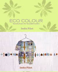
I have one of India’s books; Eco colour botanical dyes for beautiful textiles

shopping

This is a very detailed book with years of research distilled into the one publication.  As well as a comprehensive listing of plants and berries that will produce specific colour ranges, there is a chapter on special effects which India uses so well in her work.  These include hot and cold bundling methods for eco-prints, marbling using onion skins, beating colour into cloth, shibori and layering techniques, using resists, solar dyeing and screen printing.  The delights of using mud, cow pats and dirt are all explored.

As with many books, I’ve had this one for a few years and haven’t tried any of the ideas in it so I decided to do a couple of experiments.

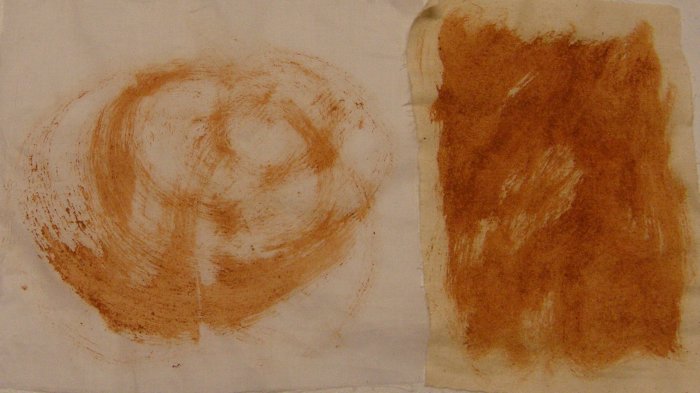
I did some earth painting, using the wonderful red soil of the land up here (it’s a very particular dirt called Pindan which is widely found in North Western Australia).  India recommends mixing the dirt with a little flour and some water to make a paste. I did this and then used a paint brush to do thick and thinner sweeps on calico.  The result is a deep orange/red colour.  The texture is a little rough and gritty.  I know from experience that the colour is really fast on clothing!

OLYMPUS DIGITAL CAMERA

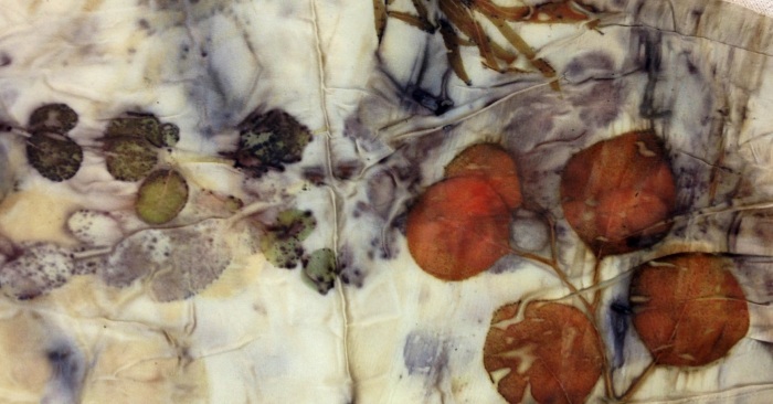
I used some Eucalyptus leaves to try bundling and steaming.  I tested a number of small bundles on different silks, linen and calico, wrapping the leaves in the fabric and then steaming for half an hour as per the instructions.  The results were disappointing as I only got vague hints of colour on the fabric and not the strong leaf impressions indicated in the book.  The best sample was a long silk chiffon scarf which I unwrapped, then wrapped with more leaves and steamed a second time.  You can just make out some leaf shapes but again it is not very clear.  More experiments needed with this technique.

OLYMPUS DIGITAL CAMERA

The technique I had most success with was the hammering of leaves into cloth.  I picked leaves from a couple of plants in the garden, folded calico fabric over then and hammered with a rubber mallet.  It took a lot of hammering but the results were really clear and good.  I like India’s suggestion of using this technique on clothing, and then when it fades just hammering new prints on top so the clothing evolves and changes over time.

OLYMPUS DIGITAL CAMERA

OLYMPUS DIGITAL CAMERA

Sources:

http://www.quiltingdaily.com/blogs/quilting-daily/archive/2010/08/26/go-wild-dye-textiles-naturally.aspx

http://tafalist.blogspot.com.au/2011/03/india-flint.html

http://prophet-of-bloom.blogspot.com.au/

Flint, I 2008 Eco Colour: botanical dyes for beautiful textiles, Interweave Press Loveland

Assignment 4 Research Point part 2 – Review of textile artist – Michael Brennand-Wood

Choose two internationally known textile artists whose work you find particularly inspiring.

  • Describe their work, in terms of materials, scale, colour, technique, and imagery.
  • Consider how the artist has used any of the elements listed above to express the concepts behind their work.

The first artist I have chosen to look at is Michael Brennand-Wood, an artist from the UK who describes himself as “an artist with a sustained interest in textiles” (Ideas in the Making, Maker of the Month) .

dreams

Image: 12 Dreams Within the Here and Now

One of the inspiring aspects of Michael’s work is his combination of two materials that are traditionally divided in their use between the sexes – wood and thread, and his studying and use of embroidery from a male point of view at a time when it was a very female dominated activity.  The base framework is often wood, using skills he picked up from his grandfather and Michael’s early grounding from his grandmother was how to knit and sew.  He pursued this by studying embroidery at university and since then has combined the areas of wood and embroidery in his artistic work. These materials have been added to with lace, paint, glass and collage.

Most of Michael’s earlier work is around 1 metre in each dimension, with the interior packed full of small detailed work. Later works become larger particularly for commissioned pieces. The colour palette varies depending on the theme, with many works in his recent floral theme reflecting the vibrant, bright colours of flowers with lots of contrast and interplay between light and dark.

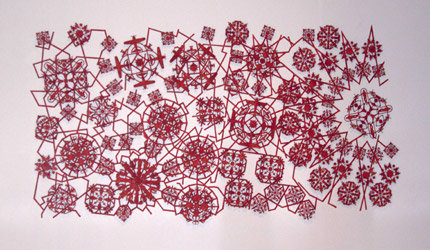
In the mid to late 1990s he produced a number of black and white works, contrasting with strong reds. this coincides with his phase of working with lace so the designs are very open and thread-like. As a lace maker myself I find his interpretations of lace fascinating, particularly his inclusion of non traditional motifs into lace work that from a distance looks very traditional but in fact is not even made of thread.  For example Lace The Final Frontier is made of wood and includes images of aeroplanes, propellers and skulls.

Final frontier

Image: Lace the Final Frontier

Michaels says about this work “My intention is to construct a ‘military lace’ emblematic of conflict and the annexing of resources and territory. Imagery for the roundels is drawn from three sources; lace, weaponry, and the Rorschach test. The visual field of the work echoes the instructional, pricked, diagrammatic papers on which bobbin laces are constructed – in this case a fusion of Islamic and Western geometry”. (Lost in Lace).

I could not find a reference for the choice of red as the colour but it does have military connotations with the reference of being blood-red. The choice of a lace based design, although seemingly contrasting with the military theme, actually provides a good basis for showing the annexing that Michael refers to and the connections made and broken between the different cultures.

Michael’s 21 century work has seen a move into more 3 dimensional textiles and an exploration of a floral theme interpreted through machine embroidery. He is inspired by patterns in historical textiles and interprets those in a modern way.

flower head

Image: Flower Head- Narcissistic Butterfly

Flower Head is a very detailed piece of work, combining many brightly coloured elements that float above a more subdued base.  This is a move away from the 2 dimensional pieces that were produced in his earlier work as Michael becomes more interested in 3-dimensional forms and the impact of space.  In an interview on Ideas in the Making, Maker of the Month, Michael says:

“I think one of the strongest characteristics of my work is the illusion of space. I’m interested in exploring the space between the second and third dimension”.

A new project for 2015 is to extend his floral work into an outdoor project that combines planting and artwork. This is planned to take place in the Abbey gardens in Bury St Edmond and funding for this is being sought through crowdfunding platforms.

As well as being a working artist, Michael is a respected curator. For the exhibition he curated in 2014 at the Blue Coat Display Centre he said ‘Anyone who knows or has spent time with me is probably waiting for the moment where I career from Art making into Music making in all its diversity and sonic excitement. I’m convinced that there’s a soundtrack to most people’s lives, a song, title, lyric that inspires. I’ve never made anything when I haven’t been listening to music. It fuels my work, drives a process and allows me access to the experience of others, whether sound, rhythm, title or lyrical snapshot.

This passion for music can be found in the way Michael describes some of his work.  In his artists statement for Transition and Influence, Michael describes his works as colourful, dramatic and rhythmic; words that would equally be at home describing an operatic work. There is a fascinating article on West Dean Visual Arts website which details some of the influences in Michael’s work and the strong musical references within the pieces.  This comes through in repeated and rhythmic motifs through his works with interlinking strands or themes, also referencing his interest in lace.

random

Image: Random precision

Sources:

http://www.themaking.org.uk/content/makers/2011/02/michael_brennand_wood.html

http://lostinlace.org.uk/artists/michael-brennand-wood

http://brennand-wood.com/michael.html

http://www.bluecoatdisplaycentre.com/exhibition/music-makers/

http://westdeanvisualarts.com/2013/04/04/visiting-artist-michael-brennand-wood/

Assignment 4 Research Point Part 1

The first part of this research point is to “write some notes in your learning log on how you think the work of the textile artist differs from that of the designer, the designer-maker or the craftsperson.”

Here is a quote from Saint Francis of Assisi (1181-1226):

“He who works with his hands is a laborer.

He who works with his hands and his head is a craftsman.

He who works with his hands and his head and his heart is an artist.”

This distinction between the levels of laborer, craftsman and artist may not be so appropriate with today’s definitions of textile artist, designer, designer-maker and craftsperson.  Many home based hobbyists will describe themselves as craftspersons but will still throw themselves heart, body and soul into what they create.

Grayson Perry provides another way of discerning the divide between art and craft in his interview for the British Museum (Craft in the information age 2011) in which he says:

“The difference between craft and art I define as craft being something that can be taught, and art coming much more from the inspired individual. Many artists are extremely poor craftsmen, many crafts people are rubbish artists.

This seems to me to be a very appropriate and accurate description of the difference between an artist and a craftsperson. A textile artist however, is a combination of the two; a person who is an inspired individual, a creative person, and a skilled craftsperson at the same time, although it can also be argued that someone who labels themselves as an artist may not necessarily have good craft skills.

In The Textile book (Gale, C and Kaur, J), definitions of a Designer, Designer-Maker and Craftsperson are given as follows:

Designer – someone who develops ideas with a full understanding of the requirements of the textile manufacturer and the marketplace. Someone who designs items that will be made, usually in large quantity, by another company.

Designer-maker – someone who designs and produces one-off or small batch quantities. They tend to be focussed on design first and production second and are not overly concerned if their design is made by someone else.

Craftsperson – very similar to a Designer-maker but focused more on the process of making, with every step of the making process being important to them.

The term designer-maker appears frequently in internet searches and seems to have particular relevance to the production of one off and small production runs of unique furniture.  Damon Lewis from Darwin in Australia has his website called www.designermaker.com.au  and specialises in furniture and sculpture. In the UK www.designermakers.org.uk  is a collection of designer-makers producing bespoke contemporary furniture by commission.

The role of a designer stands separate to the other three being discussed here.  A pure designer does not make items themselves, they produce the ideas and designs for other people to create.  With textile artists, designer-makers and craftsperson there are large areas of overlap and the boundaries are blurry, so people adopting these titles may choose one because they think it sounds better, or more upmarket, than another term rather than because it is more applicable to what they do. This is an issue picked up in The Textile Book where they discuss the trend for galleries and funding organisations to try to upscale and gain credibility for textiles in a fine arts setting by using the terms of artist or designer -maker instead of craftsperson which is viewed as being more downmarket.

The crossovers between designer-makers and craftspersons are perhaps the most apparent and it can be harder to describe what differentiates them.  To the interested viewer or purchaser the difference may not be apparent but it is based around the method of production.  The designer-maker may design a prototype themselves, then outsource the making of it.  A cratsfperson is more likely to make all items themselves or, if they do outsource the making, that making will still be done by hand by other craftspeople whereas a designer-maker may outsource their idea to be made by machine even if their prototype was crafted by hand.

The second part of this research point is to investigate the work of two internationally known textile artists and I will do this in a separate log entry. Then there are more questions as follows:

How do you view textile art? Do you think about it in the same way that you would look at a painting or a piece of sculpture? How far do you feel it has been accepted as a medium for fine art by the fine art establishment?

The question of how I personally view and think about textile art in comparison to other art forms is fairly simple to answer.  A painting, piece of sculpture or art work in another medium I will simply look at in terms of like and dislike.  I will look at why I have that reaction – is it the colour, style, composition or maybe the subject matter that creates my like or dislike? With textile art I will have that instinctive like/dislike reaction and analysis of why but then I will look at how the piece has been made.  I will look more closely at the materials that have been used, see if I can spot how it has been constructed and pick out ideas that I might be able to use myself.  I want to take a piece of textile art apart or to see step by step photos of it being made so I can really understand the process behind it as well as see the finished item.

I enjoy the Lord of The Rings trilogy of films and have the extended versions of the DVDs.  These include over 9 hours of behind the scenes footage showing how the films were created including the design process and insights into the  workshops and costuming departments.  This is fascinating to see both the level of detail that has gone into these films but also some of the ways in which props and sets were made and costumes were designed, materials chosen, materials dyed, over-dyed, printed, stitched, beaded and aged.  It is that type of background information that I desire when I see a piece of textile art – the “making of” documentary.

The acceptance of textiles as fine art really depends on how fine art is defined.  Like other definitions in the artistic field, there appears to be some discrepancies in what fine art actually is.

Universities that have arts degrees and fine arts degrees differentiate between the two by the amount of specialism, with an arts degree involving wider practice across a number of areas that could lead to careers in a range of different fields, and a fine arts degree focussing on one specialism and leading to professional practice in that specialism.

Clara Lieu, visual artist and an adjunct professor at the Rhode Island School of Design, says in an article in The Huffington Post about visual art versus fine art:

“A prevalent opinion is that all fine art is visual art, but that all visual art is not necessarily fine art. One common point of view is that the original motivation for making the artwork is what distinguishes visual art from fine art.  Visual art encompasses everything that is visual, is extraordinarily wide in scope, and includes everything from a Monet oil painting to commercial concept sketches made for an animated movie. Many people see fine art as being generally devoted to artworks that are made purely for the sake of themselves.”

If we follow the premise in these views, then textiles acceptance as fine art depends on it being made by a professional artist specialising in a narrow field and made purely for arts sake rather than the fact of it being a textile work. In The Textile Book (Gale, C and Kaur, J) the authors say “The issue of textile art is not fundamentally about whether it is fine art, design or craft; it is about accessing fine arts’s industrial infrastructure, which is increasingly just a part of the media, leisure, tourism and interior decorative industries”.

A review of auction houses shows textile work being included in Fine Arts auctions.  Sothebys include in their Fine Asian, Australian and European Art catalogue a Le Corbusier print in wool and cotton.

With the blurred definition of fine art and the broader usage of the term fine art, the acceptance of textiles as a medium for fine art is widespread.

Addition 24 August 2015

Last week I was in a waiting room browsing through magazines and I came across an article titled “‘D’ for design” in Vogue Living Jan/Feb 14 by Polly Dickens, the Creative Director for the homewares chain Habitat.  The article expresses her views on the importance of good design and, fundamentally, what makes for good design in the first place.  Polly Dickens hast he view that good design is really about attention to detail and the thoughtfulness that goes into making something.

She uses the term designer craftsmen to mean a designer who knows how to make a thing, the person who knows how a product is put together and could make it themselves, to differentiate from a designer who sits at a computer and produces a CAD image to be made in a factory.  To quote “this is what makes something tactile yet functional, and at the same time satisfying. This is a word I constantly return tom because good design has to do with function, but also emotion; the two must be intrinsically linked, because if something works perfectly, it is as emotionally satisfying as it is functional, and this brings a great sense of peace to our daily lives”

Polly Dickens also places emphasis on the input that a manufacturer can have on a design, and this is an interesting viewpoint as it is one that was not addressed earlier in this research point.  She gives the example of sending an idea, in this case a piece of watercolour art, to two different manufacturers and basically seeing what they came up with.  Her example used a high-tech factory in Portugal and a little carpet weaver in India and from the same piece of art the two manufacturers produced a range of bedding and a rug.

This suggests a more collaborative process between the roles of designer and manufacturer and possibly a reiterative process where an idea is circulated between the parties with each adding input until the final product – or range of products – is decided upon.  I wonder what would happen if a theme book was circulated between students and each added their input and then the resulting theme book was copied and each student produced their own interpretative work?  Other collaborations spring to mind like a weaver working with a potter to cross pollinate ideas based on a single design. A collaborative project such as that involves a level of trust between the artists but could result in some very exciting work that takes each person in directions they have not ventured into before.

Sources:

Craft in the information age available from http://blog.britishmuseum.org/2011/09/15/craft-in-the-information-age/

Gale, C and Kaur J, 2002, The Textiles Book, Berg, Oxford

https://claralieu.wordpress.com/2013/04/06/ask-the-art-professor-whats-the-difference-between-fine-arts-and-visual-arts/

http://www.sothebysaustralia.com.au/list/AU0786/289

Reflection on tutor feedback after Assignment 3

I am very pleased with the feedback I have received from my tutor; it is very positive and also provides some really helpful pointers for areas in which I need to build up my strengths.

In general terms I need to remind myself to continue to extend outside the set coursework and to be inspired by imagery and drawings rather than try to reproduce them.  I also need to look at how elements from a number of sources can be combined to create a new work rather than only working from a single image.

I have come up with a 3 point action plan based on specific pointers in the feedback:

1.  Colour studies – build on the work done so far on colour and do some dedicated sketchbook work on colour studies.  To facilitate this I have ordered the David Hornung book Colour: A workshop for Artists and Designers and will look at doing some of the exercises in that when it arrives.

2.  Mark making – free up my pencil mark making to be more spontaneous, energetic and not so careful and delicate.  I am going to go on a field trip with my sketchbook to capture what I see expressively and rapidly.  I am going to take charcoals as well as pencils and see if a change in medium affects my way of working.

3.  Theme book – reexamine the books I have and make studies and experiments under the headings of texture, colour, composition, form and materials.  I have extended the return deadline on my library books to be able to do this.

Assignment 1 Research Point

Another somewhat late entry on this research point, which as well as including a visit to an exhibition of contemporary textiles also says to visit one historical or ethnographical collection in a stately home. As mentioned previously, as I live in a very remote area and I was hoping that I would get a trip to Perth in during this course but I have not been able to do this – Perth is 1350km away so not exactly a day trip!

I have decided to write about a specific textile item that is very significant in Australia – The Rajah Quilt.

Rajah1

Image source: National Gallery of Australia

The Rajah Quilt was made in 1841 by prisoners and ladies sailing on board the convict ship Rajah.  Centred along the lower border are the following words:

“To the ladies of the convict ship committee, this quilt worked by the convicts of the ship Rajah during their voyage to van Dieman’s Land is presented as a testimony of the gratitude with which they remember their exertions for their welfare while in England and during their passage and also as a proof that they have not neglected the ladies kind admonitions of being industrious. June 1841”.

Rajah5

Image source: National Gallery of Australia

In 1841, van Dieman’s land was the name given to what is now called Tasmania, the separate island that is part of Australia.  The first European to land there was the Dutch exploere Abel Tasman who named the land in honour of the Governor-General of the Dutch East Indies who had sent Abel Tasman on his voyage.  It was not until 1856 that the name of the island was changed to Tasmania.

The convict ship Rajah departed the UK in April 1841 for the 3 month voyage to van Dieman’s land.  On their journey they were provided with fabric, thread and basic sewing supplies to keep them occupied during the journey.  These materials were provided by the Quaker group, the British Ladies Society for the Reformation of Female Prisoners which had been established in 1816.

On arrival in van Dieman’s land the quilt was presented to the Lieutenant-Governor’s wife, Lady Jane Franklin. The movements of the quilt is hazy after that.  At some stage the quilt was returned to the UK to be presented to Elizabeth Fry who had founded the Quaker Group, but it is not known if it arrived before her death in 1845.  The quilt remained out of public knowledge until 1987 when it was discovered in a box in a Scottish attic.

The Rajah Quilt is only made available for public viewing once per year due to its fragility.  It is made from cotton sheeting with chintz applique.  The wording is in silk thread. The central panel of applique is in a technique known as broiderie perse which is supposed to be because of its resemblance to Persian embroidery.

Rajah2 Rajah3

Image source: National Gallery of Australia

The quilt is large, over 3 metres in each dimension – the full size can be appreciated in this next photo:

Rajah4

Image source: ABC

The design is attributed to Kezia Hayter, a free woman who was sent to assist Lady Franklin in the formation of the Tasmanian Ladies’ Society for the Reformation of Female Prisoners.

Debbie Ward, head of conservation at the National Gallery of Australia, thinks that the convicts were instructed to make the quilt, saying that  “If you were given a couple of metres of fabric to make things to sell en route or [for yourself], there is no way you would want to give that up to some rich little lady when you arrive.  We not talking here about people who are grateful to be sent to Tasmania.”

The workmanship varies across the quilt, with some stitches as long as 1cm and others having 15 stitches to the cm. Some of the blocks were sewn in backwards.  It is guessed that the stitchers worked mainly up on deck during the daylight, but may have also worked in poorer light conditions which would have impacted on the stitching and construction.

A book on the history of the Rajah Quilt and the convicts who made it has been written, Patchwork Prisoners: the Rajah Quilt and the women who made it by Trudy Cowley and Dianne Snowden (Research Tasmania 2013). Unfortunately (and surprisingly) the State Library of WA does not have a copy so I have been unable to borrow it.

A reproduction quilt pattern Rajah Quilt Revisited has been designed by Lessa Siegele with permission of the National Gallery of Australia and is more achievable for the modern quilter being half the size of the original and with the added advantage of being able to be made by sewing machine.

So well known is the Rajah Quilt in Australia that there is an award the Rajah Award that is presented annually by the Australiasian Quilt Convention to acknowledge an outstanding contribution to quilting in Australia.

Sources:

http://nga.gov.au/rajahquilt/

http://www.abc.net.au/news/2013-06-14/rajah-quilt-1841/4754552

http://www.theaustralian.com.au/arts/review/stitches-in-time/story-fn9n8gph-1226663120523

http://www.aqc.com.au/Melbourne/aqc-awards/#sthash.vHbqut0b.tqeh9YYK.dpbs

Assignment 3 Reflection and review against assessment criteria

This assignment included a few new areas of work for me and it was quite exciting to try out new techniques.  Developing images in stage 2 and trying to produce the feel or values of an image in fabric rather than create an exact copy was quite a challenge and some of my attempts were more successful than others.  I found during this process that I was having more success when I let myself work more loosely and in a freer way – for example with my waterlily and cyclone images – than when I tried to be controlling as with my Poinsianna image.  This was quite a learning point for me as I have always had a tendency towards control and exactness.

I found the fabric manipulation exercises time consuming but valuable in encouraging me to sample different techniques. Simply reading the recommended book by Colette Wolff was a huge eye opener in itself and I am pleased to add this to my own collection.  As mentioned in my log entry on this project I was disappointed in my plain calico sample of manipulation techniques but turned this around by producing larger samples of other techniques which were more successful.

Starting my theme book – Ancient Egyptian Jewellery – was also exciting as this is going to lead into my final project “A piece of your own”. I do not know yet what I will create for this, I want to see where the theme book leads me.  I will constrain myself though to produce something that is flat for ease of postage or that can be folded flat (like a concertina book).

I actually feel that this assignment and accompanying work has been a bit of a turning point for my personal development. I have done the samples required but then diverted into more experiments – with the tyvek and wire experiment, three fabric collages based on one beach photo and three more fabric manipulation samples.  I have been able to use my own printed fabric in one of the exercises and in my sketchbook and it was great to do this.

I also feel that my sketchbook work has improved.  Not only am I adjusting to working in a larger format but my style is becoming freer and less constrained.  I am certainly creating more mess!

Assessment criteria

Demonstration of technical and visual skills.

My technical skills for this assignment have been mixed and if I want to do more manipulation work that involves layering and stuffing then I need to improve on this.  The positives were the other items in that I feel my applique skills were good and my other manipulation samples worked well.  Visually I am thinking more about colour and placement, and also starting to think more about composition and whether I want a piece to look balanced or deliberately off-kilter.

Quality of outcome.

I believe that I have appropriately applied the knowledge I have gained to the exercises and, apart from the aforementioned poor sample, I have achieved quality work.  I have attempted to show my thinking in my learning log and identify weak and strong points.

Demonstration of creativity.

I do believe I am improving in my creativity and skills.  I am quite excited about the changes in my way of working and feel that the accountant part of me is starting to give way to the artistic part!  I tried to extend beyond the course requirements, do more experimentation and to produce work to my own style.

Context.

I had a few opportunities to undertake different workshops during the time of this assignment, with subjects as diverse as painting with pastels, freeform knitting and crochet, Reticella embroidered lace and mixed embroidery techniques.  These were all fun to do and taught me new skills.  I explored the work of Josef Albers which gave me a greater understanding of the colour exercises done earlier in the course.  I also discovered Marit Fujiwara and an interest in marbling fabric which I am going to pursue.

Sketchbook update

I’ve been so busy posting updates on my course work that I haven’t shown sketchbook work for quite a while. Here is what I have been working on.

Small sketchbook

A piece of the fabric I marbled recently, with paper flaps either side with different cut outs.

OLYMPUS DIGITAL CAMERA

So one flap can be closed…

OLYMPUS DIGITAL CAMERA

Or both:

OLYMPUS DIGITAL CAMERA

This could be used in fabric with cut outs and/or sheer overlays coming in from different directions.

A piece of driftwood found on the beach.

OLYMPUS DIGITAL CAMERA

A turtle done on tracing paper and then glued onto a background with light watercolour.

OLYMPUS DIGITAL CAMERA

Circle doodles:

OLYMPUS DIGITAL CAMERA

Large sketchbook

I have been doing more work in the larger sketchbook and feel quite comfortable working with this size now.

These first two were done after my visit to the Orchid Garden at Singapore Botanical Gardens.

OLYMPUS DIGITAL CAMERA

OLYMPUS DIGITAL CAMERA

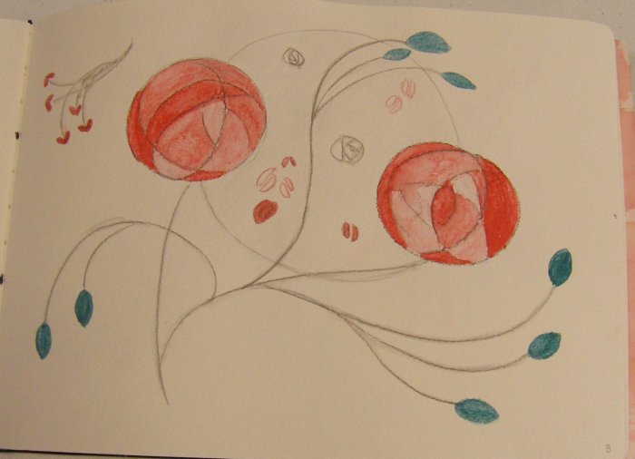
The next two pages are based on the work of Charles Rennie Macintosh – very iconic symbols of roses.

OLYMPUS DIGITAL CAMERA

OLYMPUS DIGITAL CAMERA

The red painting below is copied from a carrier bag from Poppy fabric and the blue version underneath is my own interpretation using orchids as the basis. These would look good screen printed as they have strong, bold outlines.

OLYMPUS DIGITAL CAMERA

OLYMPUS DIGITAL CAMERA

Another pair of pages, the first one was a sheet of music painted with watercolours and then selectively burned.  The second page was messing around with musical symbols.  I feel the central motif of the musical stave that then splits off into different directions could be used in textile work; I can see this being stitched or even coming out of the fabric in wire to make a 3d piece.

OLYMPUS DIGITAL CAMERA

OLYMPUS DIGITAL CAMERA

I wonder why I had a spate of working in pairs?  Here is another duo, this time with some collaged papers and pictures, layers of paint, some scribbling with black pens and overlays of gesso with areas masked off.  These were really fun to do and very experimental for me.

OLYMPUS DIGITAL CAMERA

OLYMPUS DIGITAL CAMERA

Ink splatters blown across the page using a straw.  Wonderful lines like cracks in glass. I pressed the next page onto the ink before it was dry and got some smudges carried over. I washed over these smudges with a silvery grey paint and then when dry used some car gaskets as stamps.

OLYMPUS DIGITAL CAMERA

OLYMPUS DIGITAL CAMERA

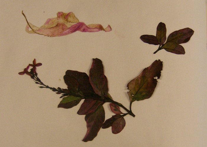
Just a single page this time, a pressed flower and leaves from the garden and a watercolour pencil sketch of a fallen leaf that was partially curled up and drying. The leaf shape reminds me of the experiments I did with Tyvek and I can image tyvek making very good leaves and other organic forms.

OLYMPUS DIGITAL CAMERA

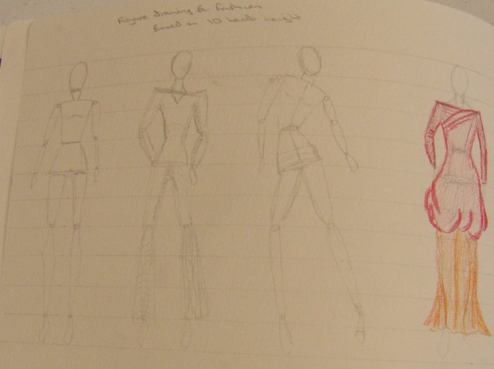
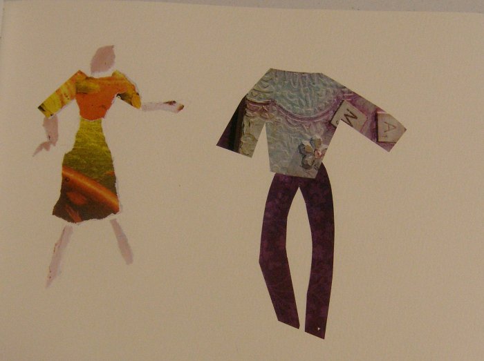
My last two pages were sketches where I was practising figure drawing for fashion.  These models are based on 10 “heads” in height instead of the standard life drawing which normally uses 8.  Fashion models have very elongated legs.  I tried to get a sense of movement and also to get used to sketching an underlying frame to then dress with clothes. On the next page I used some paper to make collages.

OLYMPUS DIGITAL CAMERA

OLYMPUS DIGITAL CAMERA