Assignment 4 Review and reflection against assessment criteria

This seems to have been the longest assignment so far but I think this is because of all the extra non-assignment work I did (sketchbook work, colour studies, theme book work) rather than the assignment itself. Looking back over my learning log I was quite surprised at just how much work I have done in this time.

For projects 8 and 9 I had my usual mixture of good and not so good results.  I use the term ‘not so good” rather than “bad” as I feel I learn something from every sample even if I do not particularly like the piece itself.  I enjoyed weaving as a whole, particularly with the non-standard materials even though these were harder to work with.

I tried to extend the scope of the course work by exploring the ideas further than required and, as with previous assignments, this has produced the work I have been most pleased with.  The projects and assignments are acting as a springboard for the development of my own ideas and leading into my own explorations of the basic techniques which I think is movement in a positive direction.

Sketchbook

My sketchbook work during this assignment has focused on producing firmer, bolder marks rather than fine work.  I have done a couple of field trips to do some work outside and this helped with the quick studies.  I also found that changing to a darker pencil helped and now use a 3b or 4b rather than my previous preferred choice of H or F.

Colour studies

I have to admit that when I started these colour studies I regretted saying I would do them!  I did not enjoy them but did find them valuable and eye opening in terms of my perceptions of colour.  I learned a lot about hue, saturation and value and used the information on value to inform my choices in my last piece for Assignment 4 where I wanted to blur the boundaries between sea and sand with my choice of magazine pages.

Theme book

My theme book work concentrated on producing the mood boards based on colour, materials, form, composition and texture.  This was so worthwhile and I enjoyed working on the boards as well as learning a lot from the process.  The main learning points and decisions I have made are that my final piece is not going to be a giant scarab, ankh or any other symbol from Egyptian jewellery.  I am not going to replicate a piece of jewellery either but am going to use some of my theme book work as it is intended to be used – as inspiration for a piece.

I have already progressed with my ideas for developing my final project as I have done a lot of reflection on the work done so far in the course and my theme book work.  My current ideas are inspired by the sculptural work of Marjorie Schick, the Swan Bell Tower in Perth and the wings of the Scarab beetle so quite a combination!

Assessment criteria

Demonstration of technical and visual skills.

I thought my use of materials in project 8 was good with the weaving materials suited to the frames I was using giving balance to the pieces.  I didn’t demonstrate very good technical skills with my use of materials for stage 4 of project 9 as I didn’t allow enough space in my design for the bulk of the fabric and cellophane that I was using.  I counteracted this with good use of these skills in my additional woven piece from magazine pages.  My compositional skills could still be improved with the balance of colours in different pieces.

Quality of outcome.

This assessment criteria covers content, application of knowledge, presentation of work in a coherent manner, discernment, conceptualisation of thoughts and communication of ideas.  I believe that I have strong skills in all these areas as I am able to research each subject and apply that knowledge to the projects and I am able to present my work in a clear manner with accompanying thought processes set out at each stage.

Demonstration of creativity.

I feel that I am improving in this area but there is room for further development.  I am experimenting more now than I did in the earlier assignments but have yet to show real imagination or invention.

Context.

The research points have been interesting to work on, particularly where they involve looking at the work of other artists. They are broadening my understanding of the context in which textile artists work and the variety of approaches that exist.

Assignment 4 Project 9 Review

As with previous assignments there are a number of questions for me to address.
Did you have enough variety in your collection of yarns and other materials? Which kind of yarns, etc., did you use most? How do their characteristics affect the look and feel of each sample?

As with just about every project so far, I found my selection adequate but that it can always be improved and expanded upon. I did manage to introduce a good variety of materials in my stage 3 sample, for example paper, braid, merino wool tops and assorted fabrics.  It was certainly easier to work with standard knitting yarn and this produced the most even look.  For a highly textured look or to change the surface texture the non-standard materials worked the best although they were more time consuming to prepare and work with.  It was harder to meld the unusual materials into a cohesive look.
How did you find weaving in comparison to the other techniques you’ve tried? Did you find it slow or too limiting?

Simple plain weave is very quick to work as I found from the scarves I wove.  But for tapestry weaving with the changes in design and regular changes in the weft thread in terms of colour and/or material used it was a much longer and slower process.  I did find that it took a lot of forward thinking and planning to use these materials and I did find them a bit limiting.  However, the limitations worked to my advantage in my final additional piece worked from magazine paper as I worked with the materials and limited the weaving stitches to just a few that would work best with the pages.
How do you feel about your finished sample? Are you happy with the relationship of the textures, proportions, colour and pattern to the finished size? Is there any part that you would want to change? If so, try to identify exactly how and why you
would change it.

I would describe my finished sample for stage 4 as adequate.  I was pleased with the textures and proportions but could have improved on the colour.  I would do this by omitting the yellow cellophane completely or layering other colours on top to tone it down.  I would also paint the warp threads to make them less intrusive.  I was much happier with the additional sample I made in the magazine pages as this incorporated some of the learning from the earlier samples.
Was there any stage in the whole design process that you felt went wrong? How would you tackle this process differently another time?

Yes, I overcomplicated my design for stage 4 and made some of the sections too small and fiddly for the bulkier materials I was using.  I needed to take into consideration that the areas woven from fabric and cellophane needed more space to be effective.  More sampling before starting a design would be advised.

Which did you enjoy more – working from the source material or putting colours together intuitively? Why?

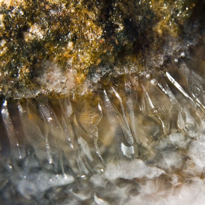
I did enjoy working from the photo of the crystallised rock as it gave me a basis for decisions on colours and the choice of materials.  But on the other hand I also enjoyed the sea to sky magazine pages additional sample as although I divided the piece into 4 broad colour areas, I then selected each strip of page individually to achieve a varied effect.

Assignment 4 Project 9 Extra sample

When I did my review of Tapestry Weaving: Design and Technique by Joanne Soroka I mentioned how much I liked the work by Jo McDonald who used second hand books to make a design using Giordes knots as per the photo below.

img087

I commented in that post that this was a technique I wanted to try but was thinking of doing a version in colour to form a landscape.  I decided that I wanted to pursue this idea and had a frame made in Jarrah wood approx 86cm x 23cm with eye screws attached at 1cm intervals inside each short end.

I used warping cotton to create the warp and, as commented in my Stage 4 sample, as I knew that the warp thread would show a lot on the surface I painted this in the rough colours that I wanted.

Then I cut 1 cm wide strips from magazine pages, selecting the appropriate colours for sea, sand, ranges and sky.  I wove these onto my warp  using the strips as they were for Soumak weaving, cutting into bundles of 5 strips 8 cm long for Giordes knots and folding strips in half lengthwise for plain weave.

I tried to create the effect of waves in the sea with the use of Soumak weaving and Giordes knots to represent the surf. The division between sea and sand is not well defined, this was a deliberate choice of similar values of colour to show where the sea comes in and recedes with the tide. For the sand area I added some darker sections for driftwood and pebbles, adding some surface weaving to represent a pile of driftwood.

The range section represents the Cape Range near Exmouth with flashes of red for the rich deep red of the Pindan soil.  I changed this section from horizontal to shaped weaving to create a hilly effect and used a lot more of the knots and Soumak to make it more 3 dimensional.

The sky returned to mostly plain weave, with some white Soumak at angles to create clouds.

OLYMPUS DIGITAL CAMERA

I am pleased with this experiment as it achieved what I wanted in creating a landscape from magazine pages.  It could be improved by deepening the sea area in the foreground and making the sand area a bit shorter.  It was very time consuming, selecting the colours, making the weave and tidying up all the ends at the back which are glued down into place.

Assignment 4 Project 9 Stage 4

This stage starts with selecting an image to be translated into a woven design.   I chose this close up of the crystallized structure on some rocks at Osprey Bay near where I live.  I chose this image because of the wonderful colours, the contrast between matt and metallic and the contrasting textures between the rougher rock and the crystal shards.

SONY DSC

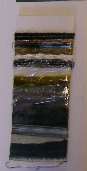
I prepared a woven colour card as per the guidance notes. This included knitting yarn, embroidery thread, metallic thread, torn silk fabric and cut strips of cellophane.

OLYMPUS DIGITAL CAMERA

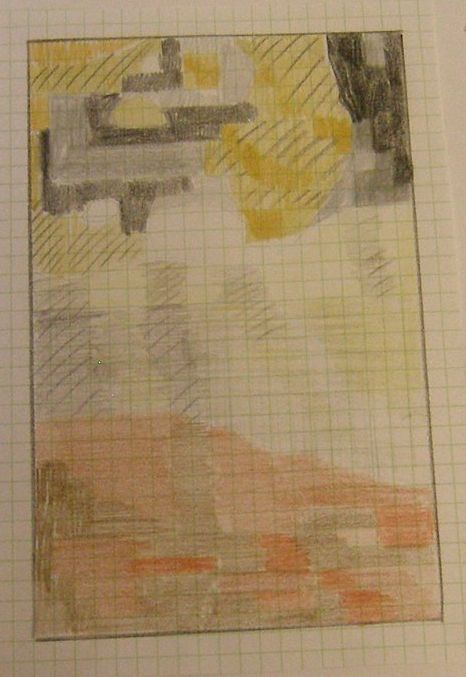
The next stage was to translate the image onto graph paper and shade in each colour. The colours do not match the woven sample and are a guide only.

OLYMPUS DIGITAL CAMERA

Finally I created the woven sample. The weaving process was more difficult with the varying thicknesses of the materials. I also found it difficult with the thicker materials to match some of the smaller areas in the original design so I ended up simplifying the design as I worked the sample.  The clear cellophane was effective for the glassy crystals but the yellow was too brash and needed to be toned down.

The top section with the mixed black and gold works well when compared to the original image as it captures the colours and the textures.  This section was easier to work as the threads were similar in size (although some I worked doubled and still took multiple rows to match one row of the black knitting yarn).

With the thicker materials the warp shows strongly, and if I was to work another piece I would consider painting the warp yarns first in toning colours so they are not so intrusive.

OLYMPUS DIGITAL CAMERA

Is this art?

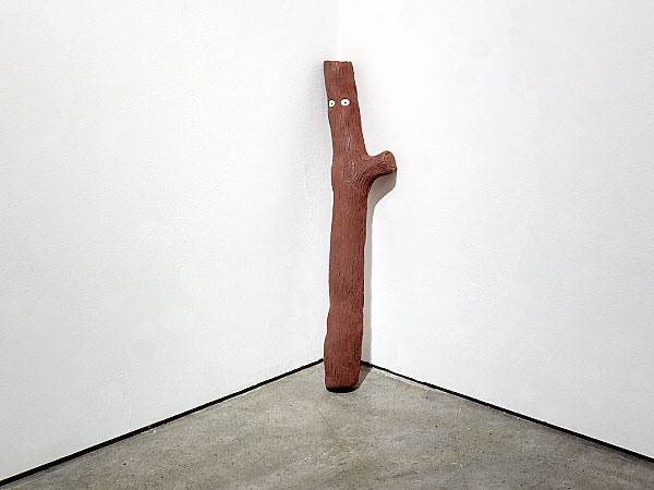
Well I really had to ask myself this question the other day.  I had a short notice trip to Perth and managed to squeeze in an hour to visit the Art Gallery of Western Australia.  I try to be open minded about art and modern interpretations of art but I really struggled with many of the pieces on display.  The one that really left me open mouthed was Stick by David Shrigley, pictured below:

stick

Source: http://www.davidshrigley.com

No matter how much I try, I cannot see this as a piece of art worthy of a place in a State art gallery – or any art gallery unless perhaps one of children’s work or as a joke.  I looked up a couple of interviews with David Shrigley and his main occupation is as a cartoonist – so maybe he did actually make this as a joke. In an interview on Time Out David Shrigley said:

“My experience of art school in Glasgow, where I studied, was that in the end, people didn’t really get what I did. I think that they thought I was doing something inappropriate, or maybe that I wasn’t a serious artist. I left with quite a poor mark, the kind of mark you get for turning up. I didn’t get the mark that you get if you’re actually talented”.
As far as the Stick is concerned, I agree with his teachers.

There were a few items that I did appreciate more and one in particular that resonated with me.  This was Maralinga by Lin Onus. This sculpture really called to me with its expressiveness and the emotion that exudes from it, and was one of the few items that I photographed.  There was no explanation of the artwork in the gallery so it wasn’t until returning home that I was able to look up the meaning behind it.

OLYMPUS DIGITAL CAMERA

The work is actually about the atomic tests that were carried out at Maralinga to the disregard of the indigenous population. The following explanation is from the http://www.aboriginal-art.de.

“The face of the mother, who protects the child in her arms from the invisible atomic cloud, is distorted by a grimace of horror and fear; the hair and clothes of the figures stream in the storm of the nuclear explosion; they stand alone and defenseless. The symbols for radioactivity, which adhere to the cloud, are shown in the colours of the British flag: blue, red and white. They become the colours of death. This emotionally loaded installation is directed against the disdain and contempt shown to the Indigenous Australians; the British and Australian governments were indifferent to the potential death or sickness of Indigenous people remaining in the area. The artwork shows not the event, but the human tragedy. It is thus an artwork of protest and not of historiography”.

OLYMPUS DIGITAL CAMERA

The juxtaposition of Maralinga against Stick, displayed in the same room of the art gallery was a huge contrast.

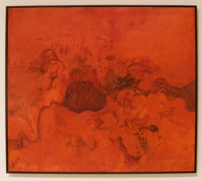
I was part way through my colour studies when I visited the art gallery, and was drawn to look at Northern Landscape by Robert Juniper because of the limited use of colour. This view is painted as if from looking down from an aircraft and it really captures that drama of the landscapes and amazing depth of colour in the outback.

OLYMPUS DIGITAL CAMERA

Another artist whose work I liked is Cathy Blanchflower with Atlas IV:

OLYMPUS DIGITAL CAMERA

I was drawn to this piece because of the deceptively simple use of repeating pattern and colour that still produces a visual depth.  If looked at through partially closed eyes or squinting then different patterns come to the foreground.

Source:

http://www.timeout.com/london/art/david-shrigley-interviewed-by-dave-eggers

http://www.aboriginal-art.de/EN/themen_politische_Ikonografie.htm

Colour studies

One of the essential reading texts for A Creative Approach is Colour: A workshop for artists and designers by David Hornung.  I did the first four assignments from this workshop and included the results in my sketchbook.

I initially struggled with the terminology, as although the terms value and hue were already familiar to me in relation to colour, I was not used to chromatic grey, muted colour or prismatic colour.  Once the book got to the stages of samples of chromatic greys with a broad range of hues and narrow value range I got stuck!  I enlisted some help from my husband who, fortunately for me, used to be a lecturer in the BBC teaching technicians how colour television worked from the first basics of how the eye sees colour.  A few explanations later and I went off to tackle the colour studies.

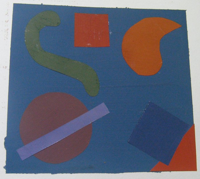
Each of the four assignments had two parts, the first part to produce samples in a broad range of hues and broad range of values, and the second part to keep a broad range of hues but key them to a narrow value range.  Each sample was approx 6″ x 6″ and the shapes used were the same in each sample so the focus would be on the colour rather than the design. I purchased a new set of Winsor and Newton Designer Gouache in the recommended colours as given in the book, painted colour swatches and applied them as collage to a base colour painted directly into my sketchbook.

To test the samples where I was trying to key the hues to a narrow value range, I converted each image to greyscale.

Sample 1 – chromatic grey, broad hue, broad value

OLYMPUS DIGITAL CAMERA

Sample 2 – chromatic grey, broad hue, narrow value

OLYMPUS DIGITAL CAMERA

Greyscale image of sample 2

This greyscale image shows where I got the value of the green/yellow piece wrong.  I re-read the book and it does say that yellows are always light in value.  I made the mistake here of using the same base grey to add to all the hues I mixed, and I should have used a darker grey to make that adjustment to the yellow.

OLYMPUS DIGITAL CAMERA

Sample 3 – muted colour, broad hue, broad value

OLYMPUS DIGITAL CAMERA

Sample 4 – muted colour, broad hue, narrow value

OLYMPUS DIGITAL CAMERA

Greyscale image of sample 4

Now this just proves that although I thought my values were quite close in the above sample, in reality they were really a long way out!  I have distinct groupings where I got some of the values to match really closely but not across the full range of hues.

OLYMPUS DIGITAL CAMERA

Sample 5 – prismatic colour, broad hue, broad value

OLYMPUS DIGITAL CAMERA

Sample 6 – prismatic colour, broad hue, narrow value

By this stage I was actually running out of paint even though I had purchased new tubes to do these exercises!

OLYMPUS DIGITAL CAMERA

Greyscale image of sample 6

Not particularly good on the value range in this sample either, although I deliberately steered away from yellow as I was keying to a dark value.

OLYMPUS DIGITAL CAMERA

Sample 7 – broad saturation, broad hue, broad value

OLYMPUS DIGITAL CAMERA

Sample 8 – broad saturation, broad hue, narrow value

OLYMPUS DIGITAL CAMERA

Greyscale image of sample 8

This sample was pulled together by eye from all the colour swatches I had already mixed.  I got reasonably close for much of it with just one darker and one lighter value jumping out.

OLYMPUS DIGITAL CAMERA

This section in the book then finishes with free studies where the student is encouraged to play with colour without any constraints.

Half my paints had run out so I was limited in what I could do.  This first one uses some of the swatches left from the samples above as the base layer.  I then played with yellow, red and the two mixed to see how the colours changed across the background and depending on how they were applied.

OLYMPUS DIGITAL CAMERA

Free painting in this next sample, again with my limited paints.  I actually really like this sample, I think the limited hues unify the piece and the broad brush strokes show freedom and the liberation of the constraints of the earlier samples.

OLYMPUS DIGITAL CAMERA

Now I really had run out of paints so I raided the leftover painted swatches.  For this next piece I chose graduating greens for the background and then random strips of other hues on top.  With this it is possible to see how the foreground colours seem to change depending on which green they appear against..

OLYMPUS DIGITAL CAMERA

Finally a playful piece mixing circles and strips at random.

OLYMPUS DIGITAL CAMERA

This was a very time consuming set of studies but very worthwhile.  I gained a much greater understanding of the interplay of colours from working through the exercises rather than simply reading the book.  I learned how my eye could be tricked with its reading of values, and how hard it is to mix a broad range of prismatic hues to a narrow value range. I learned that yellow really always does have a lighter value and that the line between a chromatic grey and a muted colour is very blurry.

Source:

Hornung, D (2004) Colour A Workshop for Artists and Designers Laurence King

More sketchbook work

I’ve done a lot of work in my sketchbook over the last week, firstly with some more quick sketches and secondly doing colour work which I will cover in a separate log entry.

For the quick sketches, I was again trying to work on the feedback I had from my tutor and tried to capture items quickly and with bold lines.

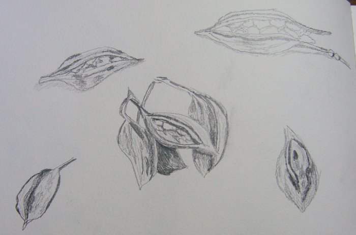
My first studies are of seed pods I picked up in town, capturing some individual pods and a group.

OLYMPUS DIGITAL CAMERA

I then did some quick sketches based on architecture in Perth.  This is the Swan Bell Tower which has sail like structures at the sides and is quite reminiscent of the shapes in the Sydney Opera House.

OLYMPUS DIGITAL CAMERA

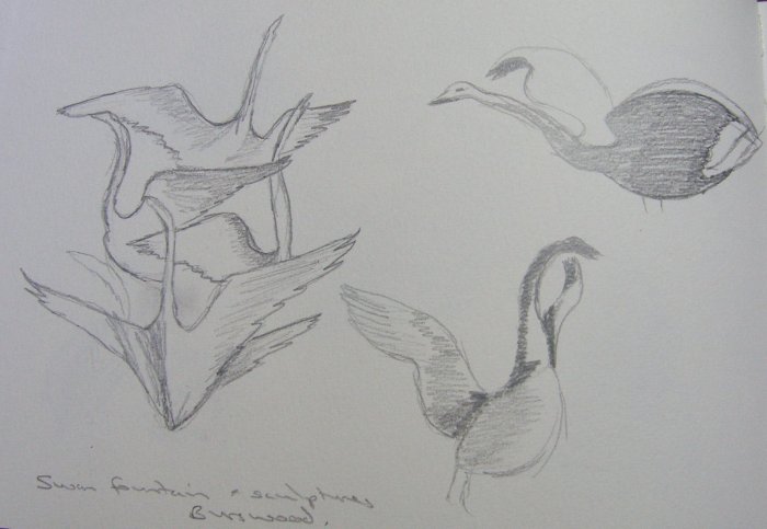
More swans next (the black swan is the animal emblem of Western Australia so features in a lot of sculpture). These sketches are from a swan fountain and swan sculptures in Burswood park, Perth.  I particularly like the way the multiple swans in the fountain are layered on top of each other and facing in different directions.  Even in two dimensions this has a lot of movement and would work well as a print.

OLYMPUS DIGITAL CAMERA

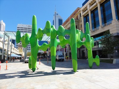
As well as a lot of bronze sculptures Perth has some very modern art that has been quite controversial.  This next sketch is one of those, it is right in the centre of the main shopping/business district.

OLYMPUS DIGITAL CAMERA

And a photo of the sculpture:

8a5f5362-b98b-4856-baf5-be02ec37de69_d

Sketchbook work

Part of the feedback from my tutor after Assignment 3 was that my sketchbook drawings were very fine in terms of being neat and delicate.  To try to free up my sketching I decided to take a field trip this afternoon and sketch “en plein air” with the aim of producing quick, rough sketches rather than taking time over them.

The majority of my sketchbook work to date has been based on photos so is done in the comfort of my home.  There is a really good reason for this – the external temperature!  As I live in tropical North West Australia the summer temperatures are regularly over 40c (104f), and even in Autumn they were over 30c each day.  Now we have hit winter today reached a very comfortable 29c (84f) which was just right for an hour’s sketching on the beach.

All sketches were done in my A4 sketchbook. The first one is the wreck of the Mildura, a cattle ship that sank just offshore in a cyclone in 1907 and that is still visible at low tide.

OLYMPUS DIGITAL CAMERA

Then I started sketching shells from different angles. The central 3 larger images are of the same shell and were done in HB pencil.  I switched to 3B for the other sketches and found that I preferred the use of the softer, darker pencil particularly for the ease of shading.

OLYMPUS DIGITAL CAMERA

My final page was some studies of broken sections of coral that I think washed ashore during the last cyclone earlier this year as there was quite a lot of debris on the beach.

OLYMPUS DIGITAL CAMERA

Book review – Tapestry Weaving, design and technique

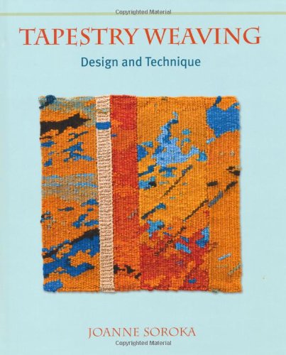
I was struggling to find the recommended books for Assignment 4 on the State library loan list so I took pot luck and ordered Tapestry Weaving: Design and Technique by Joanne Soroka. I was glad I did as I found it to be an excellent and interesting book and would recommend it to be added to the reading list!

51WP8IZTQ9L

The book starts with chapters explaining the basics of What is Tapestry? and The Origins and History of Tapestry Weaving. These were useful introductions to explain the fundamental features of Tapestry weaving and the common misunderstandings around the word “tapestry”.  I was quite intrigued to find out that originally most tapestries were worked on their sides (due to the width being too large for a loom) and from the wrong side – quite a challenge for the weaver.

Further chapters discuss simple tapestry weaving, equipment and materials and more advanced techniques including Soumak and different ways of adding knots to create surface texture.  I was particularly interested in the sections that explain adding extra wefts and warps to form a second layer of threads or tapestry and how these can be used to expand the range of surface structures.

The book covers ideas for display and hanging, and how to care for tapestries.  It also has small sections featuring contemporary weavers.  I liked the feature piece on Jo McDonald who has produced large scale works using second-hand books.  The scan below shows work in progress of book pages being knotted around the warp and the photo underneath is the finished work Unique Reflections?

img086

img087

My idea to develop this would be to mix up the weaving techniques, with some picks of plain weave, maybe some Soumak and other variations to build up a landscape from the old books.  So the books are telling the story of the land.  This could work in colour, with magazine pages used to form the colours of the landscape.

The other example that appeals to me from the book is the following piece called Golden Section which was made by the author. The aspects of this that I like are the use of strong, bold colours and the use of layers that build up colour and texture.

img085

Assignment 4 Project 9 Stages 1,2,3

This Project is all about tapestry weaving using a very basic weaving frame.  I used it as a great excuse to ask for a Rigid Heddle Loom for my birthday as, depending on the positioning of the heddle, this can act as a weaving loom or a tapestry frame.

Stage 1 is to warp up the frame which I did by following an online video from Ashford Weaving.  Stage 2 is to do some basic weaving simply to get a feel for the process, and then to start introducing other colour and techniques such as Soumak and Ghiordes knots.

This is my first sample, trying the different techniques.  Some of the techniques are lost under the rug-like effect of the Ghiordes knots near the top.

OLYMPUS DIGITAL CAMERA

Stage 3 is to do a further sample introducing different materials and experimenting freely to produce different effects. I worked my sample below in a purple colour scheme to provide a commonality to the different materials and techniques.

From the top down is as follows:

– merino wool tops Soumak weave and then Ghiordes knots

– plain weave Perle 8 cotton

– slit woven in fancy yarns, with one section of weaving twisted over another

– length of kumihimo braid woven and circled, with one end descending over lower weaving

– paper cut from an envelope, with a flat fancy stone on top held in place with metallic thread

– fancy yarn buttonhole stitched over some warp threads and extending over the paper

– glitzy fabric woven and some made into chunky French knots, next to this is an area with beads added (threaded onto the weft yarn and pushed into place after weaving)

– woven organza, underneath which the organza has been worked in Soumak weave

– more glitzy fabric in Ghiordes knots.

I particularly like the effect of adding the flat stone as this provides such a contrast in surface texture.

OLYMPUS DIGITAL CAMERA

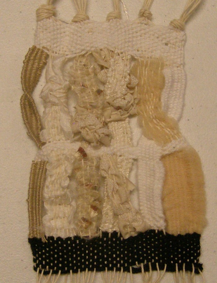
The final part of Stage 3 was to select one area from the above sample and extend this further.  I chose the section worked in slit weaving where I had twisted one section over another.  This was not a technique I had picked up from anywhere but created myself (although I am sure lots of other people have had the same idea and done similar work!) and I wanted to explore it further.

I secured the base of the weaving with a strip of black just to form a firm base.  Then I worked different widths in different yarns and materials.  To get the twist effect I cut the warp threads of the sections involved, swapped them over and re-warped them. A woven strip secured the strips in the new position.

In the second section I twisted the right hand strips, twisted the central strip across to the left, over to the right and then back to the middle, knotted the second from left strip and just twisted the left end strip around itself.  This was a very time consuming sample to make and fiddly getting the tension right after cutting and repositioning the warp threads as they were different lengths depending on the treatment of the strips. it does produce a lot of variation in textures aside from that given by the materials themselves which included embroidery thread, strips of silk fabric, strips of cotton fabric, knitting wool, mesh strips and fancy yarns.

OLYMPUS DIGITAL CAMERA

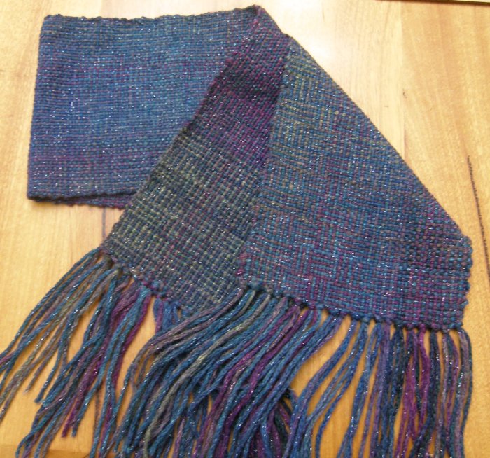
As well as doing the tapestry weaving samples for the course I couldn’t resist using the loom to make some “normal” scarves.

This first one uses 2 yarns from the same family, one a plain blue and one variegated blue/green/purple.

OLYMPUS DIGITAL CAMERA

For my second scarf I varied the warp by using a mixture of white wool with random black warps and a heavier fancy yarn.

I used two different greys for the weft and worked these in alternate blocks, separating them with narrower bands of black.

OLYMPUS DIGITAL CAMERA

It was great fun playing with my new loom, I enjoyed all the experimental samples and was surprised at how quickly the scarves worked up.