Experiments in marbling

I had my first attempts at marbling with a basic shaving foam method that I included in my log here: https://tigerctextiles.wordpress.com/2015/04/28/marbling-fabric/

I stated at the time that I wanted to do more experiments and this was reinforced when I came across the work of Marit Fujiwara https://tigerctextiles.wordpress.com/2015/05/13/review-of-artists-marit-fujiwara/ who used marbled fabric as the basis for her creations.

Some searches on the internet bought me to Galen Berry’s website http://marbleart.us/index.htm.  Galen has 30 years experience in marblng and has self-published an amazing booklet “The Art of Marbling” that I quickly purchased.

Equipping myself for “proper” marbling rather than the basic shaving foam method took some time.  I needed Carageenan which is used to create the size that the paint is dropped onto;  Alum (aluminium sulphate) for preparing the paper and fabric so that it holds the paint; the right paints, and various tools such as combs, rakes and broomstick brushes.  I couldn’t find anywhere in Australia that supplies the tools so some time with lengths of wood, nails, a hot glue gun and pins was required to create rakes and combs.  I also made some broomstick brushes by purchasing a new broom with plastic bristles, cutting these off and making them into bundles.

The size mix is prepared the day before, as is treating the paper/fabric with the alum mix so it has time to dry. For my first samples I tried using acrylic paints.  In Galen Berry’s booklet he explains that there is a vast difference between the different acrylics available and not all work for marbling.  Whether they work or not is also irrespective of price, as some good quality paints do not work well but other cheaper brands do.

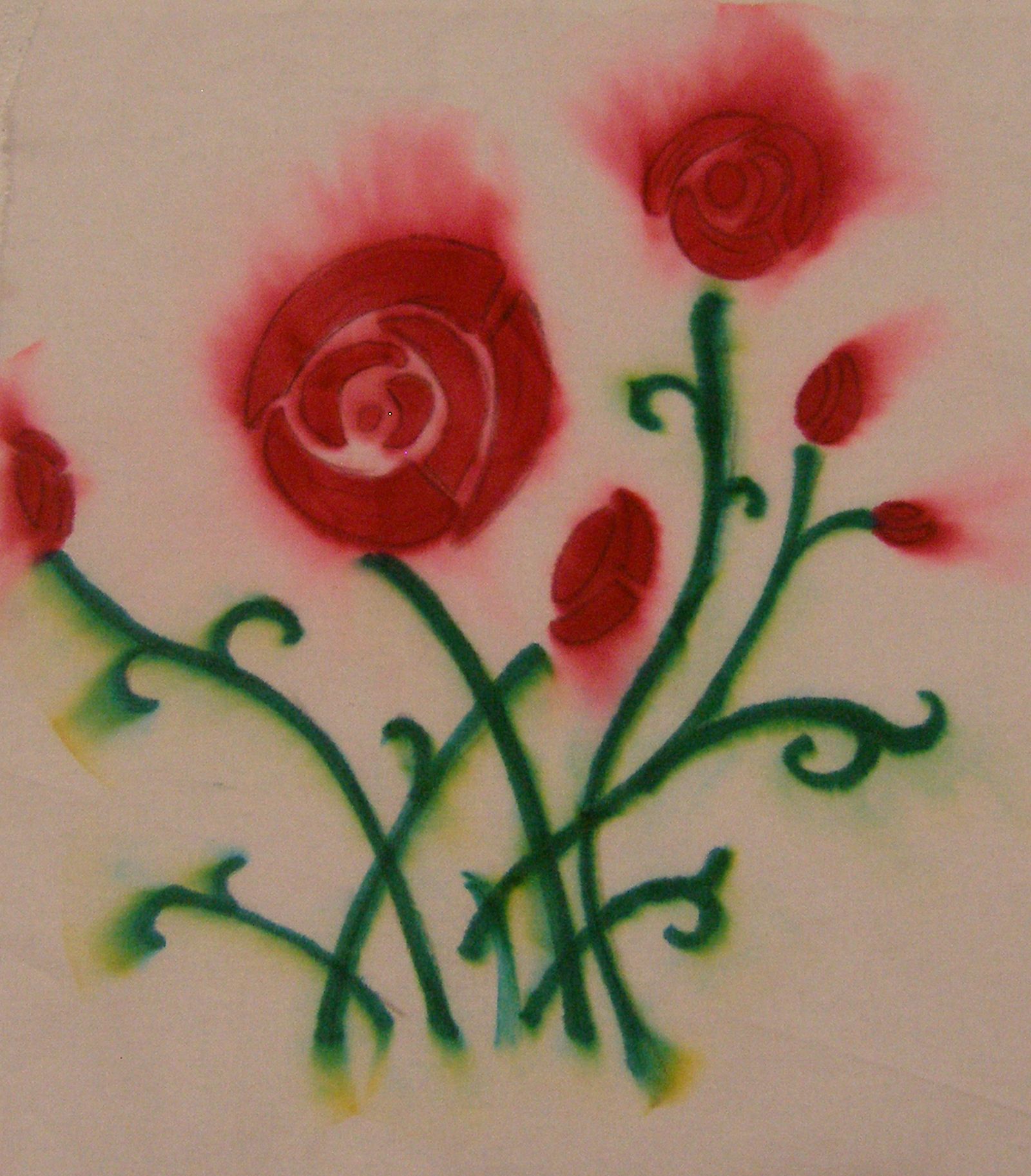
I soon discovered that my home made brushes were too short and didn’t work well.  I also found that the paints I used (Chromacryl) worked well for some colours but very badly for the rest.  In fact the only successful colour was red so I ended up with a very red based print as seen in the photo below. I did a number of experiments with the acrylic and none were successful.

OLYMPUS DIGITAL CAMERA

A rethink was in order.  I decided to try a product I haven’t used before which is Liquitex Acrylic Inks.  They come in a bottle form with a dropper so are ideal for dropping onto the size, removing the need to come up with alternatives to the broomstraw brushes.

I also got some OxGall which is a wetting agent and spent some time just dropping the inks into size to test how they spread.  All the colours apart from black needed gall added to them to stop them from sinking and help them spread.

What I hadn’t realised was that my size had deteriorated and was too runny.  I reread the booklet to discover that it keeps for up to 10 days in the fridge but mine had not been refrigerated so my first experiments with the new inks were in the “satisfactory-but-not-wonderful” category. The photo below shows a sample on cotton fabric, the colours are quite pale but there is a greater range than using the acrylics.

OLYMPUS DIGITAL CAMERA

It was after this first lot of experiments with the inks that I had a moment of serendipity.  As I was emptying the tray of size, the remaining inks had sunk to the bottom and were forming a layer on the base of the tray.  I just grabbed a piece of alumed paper and pressed it onto the base of the tray to pick up the inks.  The result was amazing as seen in this next photo:

OLYMPUS DIGITAL CAMERA

Such vibrant colours and amazing patterns!  This is so like the beetle wing designs that I was using in my final project 10 – perhaps I can create more work like this and build on that theme even more?

My next session of experiments was with some newly created size.  I managed to get some really strong colours from the inks.  Firstly on paper:

OLYMPUS DIGITAL CAMERA

And then on fabric, this time some silk that I had soaked in the alum mixture.

OLYMPUS DIGITAL CAMERA

OLYMPUS DIGITAL CAMERA

Mixed results with the yellow ink in these, with it being quite splotchy in the second print.

On draining the size from the pan I again made a print with the inks on the base, on another piece of silk fabric.

OLYMPUS DIGITAL CAMERA

Some more very exciting colours and marks, created at random from the ink remnants in the tray.

I still have some work to do on my technique.  The size is supposed to be reuseable for a number of prints but mine was getting too dirty after just two prints so I need to do some research and check if I am making it incorrectly.  Then I want to try to produce larger pieces as those above are all A4 size or smaller and I will need larger pieces if I want to use them in textile art and particularly if I want to experiment along the lines of Marit Fujiwara’s work.

A tale of two dresses

As mentioned in my previous post I have used the time while waiting for feedback on Assignment 5 to finish off other projects.  I received the feedback this morning but in the meantime had finished working on a rather special dress so thought I would write about this before responding to the feedback.

This project started 3 years ago when I decided to bite the bullet and prepare an entry for the World of Wearable Art show in Wellington New Zealand.  As well as having an interest in wearable art I also enjoy watching the behind the scenes extras included with major film productions such as Lord of the Rings.  I decided to combine the two interests by making a costume that would be a “making of” in its own right, so the one costume would show the different stages of construction.

Not settling for half measures, I decided to make my costume in very time consuming needle lace based on Venetian Gros Point lace with heavily padded edges.  The plan was to have part of the dress finished, then the rest in different stages of completion so you could see the entire “making of” by looking at the dress.

The first stage was to select a basic pattern to use as a template and I selected a McCalls pattern with an asymmetric line and a nice shape to the front.  I cut out the pattern pieces and taped together the darts and pleats to form single pattern pieces for the front and back.  Then I cut a single dart in each bodice and another on the hip line to simplify the shaping.

OLYMPUS DIGITAL CAMERA

I transferred the outline of the pattern pieces on to brown paper and then started to pencil in my design.  I designed a simple heart and flowers motif and drew 3 different size heart templates for continuity, then did the design freehand by drawing long sweeping curves down and across the pattern pieces and then branching off with the hearts and flowers.

OLYMPUS DIGITAL CAMERA

When I was happy with the design I inked it in.

OLYMPUS DIGITAL CAMERA

Next the brown paper was placed onto calico and large pieces of clear sticky backed plastic were placed on top.  This provides a smooth surface for the needle to slide over when making the needle lace.  The outlining threads were couched into place over the main design lines. These are the only stitches that go through the layers of plastic, brown paper and calico.  All other stitches are worked so they anchor onto these outlining threads but are not attached to the underneath layers.

OLYMPUS DIGITAL CAMERA

Now for the filling stitches. Stitched in Colour Streams Ophir thread in Umbrian Gold.  In this next photo the colours of the thread appear very similar, but I soon found out when I ordered my next batch of thread just how different the colours were for the same named thread.  I ended up buying 140 skeins from as many different suppliers as I could find in Australia, even asking them to deliberately send me threads from different batches so I had maximum variety.

OLYMPUS DIGITAL CAMERA

In this next photo you can see how the batches of thread differed greatly so I had to mix them up so as not to end up with big blocks of each colour variation.  This photo also shows where I started adding the underneath layers of white padding (white yarn) around the edges of the shapes.

OLYMPUS DIGITAL CAMERA

Padding in Venetian Gros Point is a time consuming operation.  Multiple strands of thread are laid over the base layer of white padding, and these threads are added in one at a time so the padding is shaped as it goes around a curve.  You can see this clearly in the photo below that shows the padding increasing in width and height.  As the covering buttonhole is stitched the individual strands that form the padding are carefully pulled through to hide the ends.  After the highest/widest point of padding is reached the strands are then carefully cut out one by one to narrow the padding down again.

OLYMPUS DIGITAL CAMERA

A section of the dress is shown below with some completed areas and some still being worked on.

OLYMPUS DIGITAL CAMERA

When the lace is finished, the couching stitches that hold down the original outlining threads are cut away by separating the brown paper from the calico.  The lace is then lifted carefully off the top of the clear plastic. At the stage in the photo below, the lace has been partially removed from the backing leaving some areas still with the brown paper and partial stitching in place to achieve the “making of” effect desired. I made a black underlay for modesty.

OLYMPUS DIGITAL CAMERA

This is the dress as originally finished, designed to show how it was made.

Lace featurette front

It wasn’t accepted into the World of Wearable Art which was not surprising.  I do not think it had the impact to show on stage from a distance but needed close up inspection to be appreciated.  For a show like WOW it helps to have a great silhouette and something that really stands out on the stage. So here I was with around 500 hours work and rather a lot of dollars spent and a lovely large piece of needle lace folded in a box.

Move on a year and I decided that the lace simply had to be rescued and repurposed.  I came up with the idea of making a full length evening dress for myself and using the lace as highlights.  I chose a very classic black velvet and made a dress to a pattern called Anna from By Hand London, an independent sewing pattern design company.  Then for the scary part – trying to envisage where the design elements of the original dress would fit on the new version and using a large pair of scissors to cut through the expanses of beautiful needlelace.

And it worked!  I very careful shaped the needle lace when cutting it to give me pieces that would curve across and down the bodice and length of the evening dress I had made.  Then I had to stitch the needle lace on to the dress, trying to hide where I had cut ends of lace.

OLYMPUS DIGITAL CAMERA

At the back of the dress, I swept the needle lace so it would go across the zip.  This is a loose flap of lace that is held in place by a simple press stud enabling it to be lifted up to reach the zip underneath.

OLYMPUS DIGITAL CAMERA

So after starting the original WOW version in 2012, the evening dress version was completed in August 2015. A very long time in the making and at one stage I really thought  I would not end up with anything wearable but I am very pleased with the end result.  One day I will make another attempt at an entry for WOW, giving more consideration to stage impact and having an amazing silhouette.

OLYMPUS DIGITAL CAMERA

Interim projects

While I am awaiting feedback on the last assignment for A Creative Approach I have used the time to complete a few other projects, a couple of which were works in progress from before I started this unit.

Below is “Sea Siren”.  This is a lifesize mask made from felt that I sculpted over a mould and stiffened to hold the shape.  The felt extends in a single piece around the mask and I pleated and swirled this to form water like waves and ripples.  I sponged the face with acrylics and stitched designs onto it using needlelace techniques.  I had got that far before I started A Creative Approach but wasn’t satisfied with the outcome so put it to one side.  I recently started work on this again, and decided it needed a lot more depth of colour so I added the darker blue silk fabric which I inserted into the channels in long strips.  I formed the ends of the strips of fabric into swirls and stitched these into place around the edge to add more texture and dimension.  The final touch was a scattering of white and blue pearls to add a bit of sheen, another texture and pick up on pearls of the sea.

OLYMPUS DIGITAL CAMERA

A more traditional piece of textiles I have just finished is a quilted jacket.  I started hand sewing the squares together on a holiday a couple of years back and it has been one of those long projects just worked on when I was away from home and needed a portable project to hand.  When started I had originally planned to make a full quilt, but once I started A Creative Approach I decided that I would be unlikely to spare the time to make enough squares for a quilt so I shortened the project into a jacket.

I selected a boxy style jacket with minimal shaping to really show off the pattern which is called Cathedral Windows.  I selected Japanese themed fabrics with a red and black overall colour theme.

OLYMPUS DIGITAL CAMERA

OLYMPUS DIGITAL CAMERA

Ice dyeing

I haven’t tried ice dyeing before, but after seeing a You Tube timelapse video (https://www.youtube.com/watch?v=IhBtRaltPIM) I decided to have a go.

I folded up my first fabric samples, thinking to get a Shibori type effect from the pleats and folds but think I used too much powder dye so the colours merged.

OLYMPUS DIGITAL CAMERA

OLYMPUS DIGITAL CAMERA

I also decided I didn’t need to use as much ice.  So batch number 2 was less ice and less dye.  The top one was pleated and folded and the lower example was just scrunched up.

OLYMPUS DIGITAL CAMERA

OLYMPUS DIGITAL CAMERA

For a general background the sample that was just scrunched up looks wonderful, like a garden bed of roses or an exploding nebula.  I haven’t got plans for any of these fabrics at the moment, they were just done for fun and experimentation.

Sketchbook work and translation into free motion embroidery

I recently posted about how I had started to do continuous line drawing straight to ink and how I felt this would be ideal for translating into free motion embroidery.  I decided to try this so selected the first drawing I had done, of blue flowers.

OLYMPUS DIGITAL CAMERA

I picked a background made during the recent Creative Colour workshop I attended and used a blue metallic thread to stitch the work:

OLYMPUS DIGITAL CAMERA

I wanted to try something more dramatic and with movement, so I found a photo online and did a continuous line drawing sketch of a sea eagle:

OLYMPUS DIGITAL CAMERA

This time I used plain black cotton thread and a background I printed during my first experiments with a Gelli plate:

OLYMPUS DIGITAL CAMERA

This has opened up new possibilities for including movement through stitch in my work.

Creating a necklace from shapes developed in Projects 4 and 6

It seems like a very long time ago that I did Project 4 and separated some images into their shapes, colour and texture.

When I was reviewing my work for the first stage of Project 10, I came across the penguin image that I used and the shapes I separated out from this in Project 4 that I further developed into applique samples in Project 6.

OLYMPUS DIGITAL CAMERA

When reviewing my work I had just been on a workshop on Creative Colour and one of the samples I produced was this; a mixture of Lumiere paints, Liquid Pearls and Shiva Paintstiks using stencilling and rubbing techniques.

OLYMPUS DIGITAL CAMERA

I decided that the shapes from the penguin image could be reformed to make a necklace so I traced the shapes, scanned them and then played around with their positioning.

Necklace

I added copper shim circles to the fabric sample and stitched these in place.  Then I traced over the necklace shapes onto clear plastic and positioned the shapes onto the fabric to get the layout of the copper and colours in the best places.  After cutting the pieces I backed them with black fabric and made a twisted cord which I buttonhole stitched around the edge of each shape.

Finally I made a loosely woven Kumihimo braid in copper wire and stitched the pieces into place.  I changed the position of one of the pieces in the final process for a better result and to give more emphasis to the focal point.

OLYMPUS DIGITAL CAMERA

I am pleased with this as an example of how an image can be developed by separating out the shapes and rearranging them to create a completely new composition.  It was also good to use a sample from a workshop and produce a finished item even though I had no end product in mind when I initially made the sample.

Creative colour workshop plus playing with Gelli plate printing

I’ve been taking some time out from the set assignments to have a play with other techniques and was fortunate enough to take advantage of a friends’ visit to attend a workshop on Creative Colour and then to follow this up with a session in my studio playing with a Gelli printing plate that I purchased recently.

The workshop introduced me to a lot of products I have not used before, including Lumiere paints, Dye-Na-Flow, Liquid Pearls and Inktense pencils.  The techniques covered included wet-into-wet work, stencilling, stamping, rubbing and layering.

Here are some of the fabric samples I produced on the workshop.  The first one is made using marker pens and then adding rubbing alcohol to make the marks bleed into the fabric.  Once dry I added black marker pen and used inktense pencils to add some depth to the colour.  I was trying for a very free and loose effect here rather than my usual controlled work and I was pleased with the end result.

OLYMPUS DIGITAL CAMERA

OLYMPUS DIGITAL CAMERA

OLYMPUS DIGITAL CAMERA

OLYMPUS DIGITAL CAMERA

OLYMPUS DIGITAL CAMERA

OLYMPUS DIGITAL CAMERA

A couple of days after the workshop I had a play with my new Gelli printing plate with an aim to producing backgrounds that could be used in future work.  I have collected a variety of tools for mark making and also used some weed seed heads to make positive and negative prints.  Some of these were multiple layers to build up colour and all add to my stash of fabrics to use in future work, with plans to use free motion embroidery on some of the seed head prints.

OLYMPUS DIGITAL CAMERA

OLYMPUS DIGITAL CAMERA

OLYMPUS DIGITAL CAMERA

OLYMPUS DIGITAL CAMERA

OLYMPUS DIGITAL CAMERA

OLYMPUS DIGITAL CAMERA

Textile art surfboard

I am coordinating an auction of decorated surfboards to take place in September raising funds for the Cancer Council through Relay for Life.  I collected used surfboards and then put out a call for artists to decorate them using whatever medium they choose.  Myself and 10 artists are working on surfboards to be auctioned and I have just finished mine as pictured below.

OLYMPUS DIGITAL CAMERA

I reworked a large wall hanging made previously and cut it to shape around the surfboard.  The background is muslin which I partially felted, dyed and hand stitched the outlines of some coral onto.  The remaining coral I made using oddments of felting experiments such as ruffle edged scarves, pieces I had felted around pebbles as experiments and so on.  I also used oddments of dyed fabrics and lace I had made so was able to create the piece using a lot of bits from my experiments box.  Hand stitching was added in various places along with some beads and shells. I was pleased to be able to construct this through recycling experimental work rather than using new materials.

Colour studies

One of the essential reading texts for A Creative Approach is Colour: A workshop for artists and designers by David Hornung.  I did the first four assignments from this workshop and included the results in my sketchbook.

I initially struggled with the terminology, as although the terms value and hue were already familiar to me in relation to colour, I was not used to chromatic grey, muted colour or prismatic colour.  Once the book got to the stages of samples of chromatic greys with a broad range of hues and narrow value range I got stuck!  I enlisted some help from my husband who, fortunately for me, used to be a lecturer in the BBC teaching technicians how colour television worked from the first basics of how the eye sees colour.  A few explanations later and I went off to tackle the colour studies.

Each of the four assignments had two parts, the first part to produce samples in a broad range of hues and broad range of values, and the second part to keep a broad range of hues but key them to a narrow value range.  Each sample was approx 6″ x 6″ and the shapes used were the same in each sample so the focus would be on the colour rather than the design. I purchased a new set of Winsor and Newton Designer Gouache in the recommended colours as given in the book, painted colour swatches and applied them as collage to a base colour painted directly into my sketchbook.

To test the samples where I was trying to key the hues to a narrow value range, I converted each image to greyscale.

Sample 1 – chromatic grey, broad hue, broad value

OLYMPUS DIGITAL CAMERA

Sample 2 – chromatic grey, broad hue, narrow value

OLYMPUS DIGITAL CAMERA

Greyscale image of sample 2

This greyscale image shows where I got the value of the green/yellow piece wrong.  I re-read the book and it does say that yellows are always light in value.  I made the mistake here of using the same base grey to add to all the hues I mixed, and I should have used a darker grey to make that adjustment to the yellow.

OLYMPUS DIGITAL CAMERA

Sample 3 – muted colour, broad hue, broad value

OLYMPUS DIGITAL CAMERA

Sample 4 – muted colour, broad hue, narrow value

OLYMPUS DIGITAL CAMERA

Greyscale image of sample 4

Now this just proves that although I thought my values were quite close in the above sample, in reality they were really a long way out!  I have distinct groupings where I got some of the values to match really closely but not across the full range of hues.

OLYMPUS DIGITAL CAMERA

Sample 5 – prismatic colour, broad hue, broad value

OLYMPUS DIGITAL CAMERA

Sample 6 – prismatic colour, broad hue, narrow value

By this stage I was actually running out of paint even though I had purchased new tubes to do these exercises!

OLYMPUS DIGITAL CAMERA

Greyscale image of sample 6

Not particularly good on the value range in this sample either, although I deliberately steered away from yellow as I was keying to a dark value.

OLYMPUS DIGITAL CAMERA

Sample 7 – broad saturation, broad hue, broad value

OLYMPUS DIGITAL CAMERA

Sample 8 – broad saturation, broad hue, narrow value

OLYMPUS DIGITAL CAMERA

Greyscale image of sample 8

This sample was pulled together by eye from all the colour swatches I had already mixed.  I got reasonably close for much of it with just one darker and one lighter value jumping out.

OLYMPUS DIGITAL CAMERA

This section in the book then finishes with free studies where the student is encouraged to play with colour without any constraints.

Half my paints had run out so I was limited in what I could do.  This first one uses some of the swatches left from the samples above as the base layer.  I then played with yellow, red and the two mixed to see how the colours changed across the background and depending on how they were applied.

OLYMPUS DIGITAL CAMERA

Free painting in this next sample, again with my limited paints.  I actually really like this sample, I think the limited hues unify the piece and the broad brush strokes show freedom and the liberation of the constraints of the earlier samples.

OLYMPUS DIGITAL CAMERA

Now I really had run out of paints so I raided the leftover painted swatches.  For this next piece I chose graduating greens for the background and then random strips of other hues on top.  With this it is possible to see how the foreground colours seem to change depending on which green they appear against..

OLYMPUS DIGITAL CAMERA

Finally a playful piece mixing circles and strips at random.

OLYMPUS DIGITAL CAMERA

This was a very time consuming set of studies but very worthwhile.  I gained a much greater understanding of the interplay of colours from working through the exercises rather than simply reading the book.  I learned how my eye could be tricked with its reading of values, and how hard it is to mix a broad range of prismatic hues to a narrow value range. I learned that yellow really always does have a lighter value and that the line between a chromatic grey and a muted colour is very blurry.

Source:

Hornung, D (2004) Colour A Workshop for Artists and Designers Laurence King

Workshops – Reticella embroidered lace and mixed embroidery Chatelaine

Alongside the workshop on freeform knitting and crochet that I did on my recent holiday, I did two day workshops on Reticella and Mixed Embroidery.

Reticella is an embroidered lace dating back to 16th century Italy.  It is a drawn threadwork embroidery worked on linen.  A frame is stitched using four-sided stitch, then an inner frame of satin stitch over a thread (for padding) to provide a firm outline.  Threads inside the frame are then counted and certain of them cut out in a grid pattern; the threads left in place are secured with needle weaving and then filling stitches are worked using needle lace techniques.  I have done needle lace before but have never done the drawn threadwork so this was a mixture of old and new techniques for me.

I completed a small square, using the stitches taught in the workshop but with my own choice of placement and modernising the traditional stitches with colour and by taking some parts outside the basic framework.

OLYMPUS DIGITAL CAMERA

The other workshop was mixed embroidery to create a chatelaine consisting of a needle case, scissor keep and scissor dolly.  All materials were provided in a kit from Colour Streams.  The base material was felt and the surface was embellished with applique, beading, silk ribbon embroidery, bullion stitches and French knots.  Bullion stitches and the silk ribbon embroidery were knew to me so it was good to learn these new stitches.

It was hard to go wrong with this workshop.  The kits provided were well colour coordinated and with the right materials it was easy to get a good result.  The tutor described it as “doodling” with the different techniques.

OLYMPUS DIGITAL CAMERA